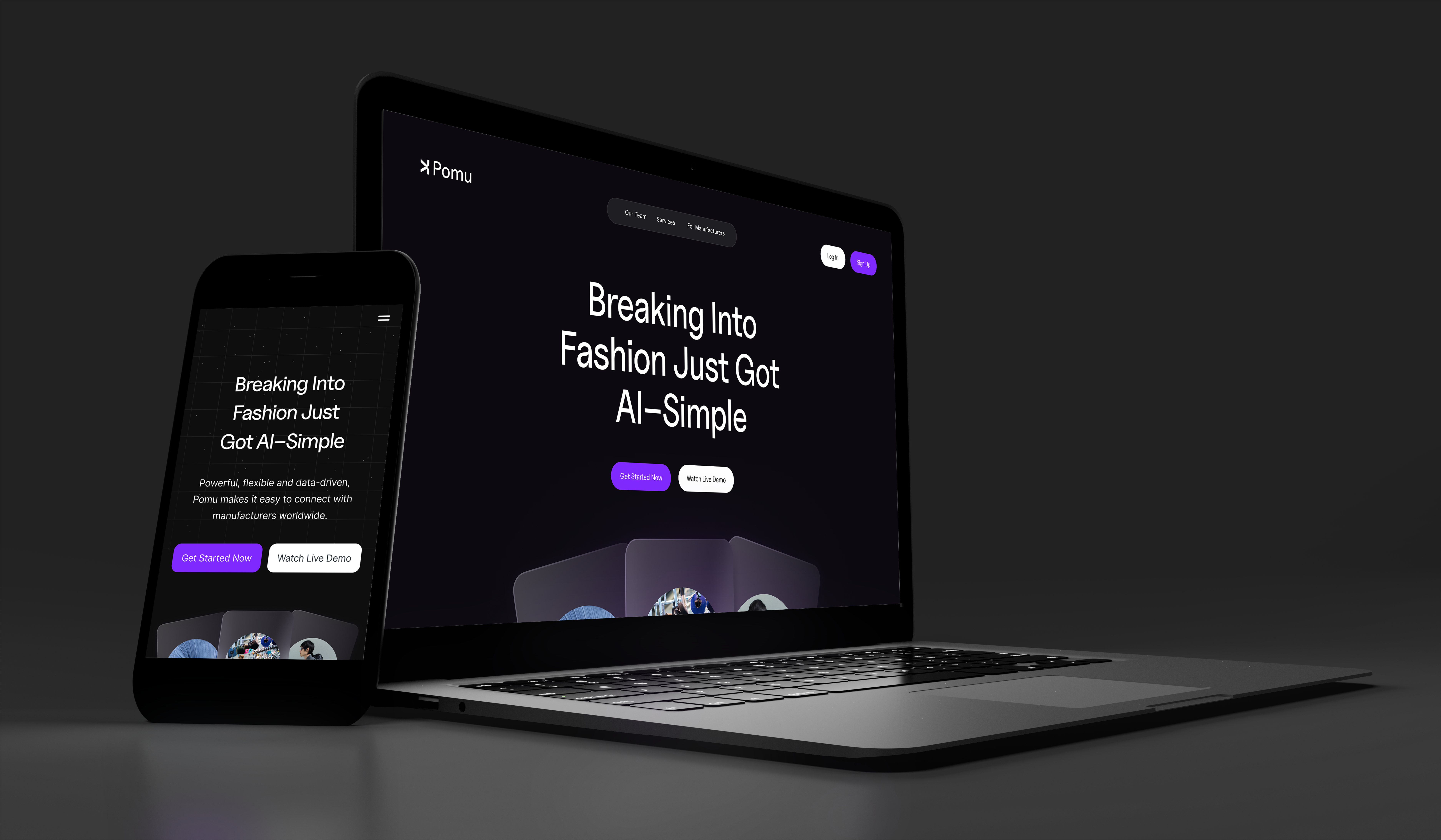
This market is built for enterprise buyers, not someone placing their first order.
Pomu's client is that independent fashion founder placing a first order, someone who has a product in mind but no manufacturing vocabulary to describe it with. I worked closely with three engineers and one other designer, and between us we covered research, the actual product, and the design system underneath it.
Where I spent my time
12+ discovery interviews
Affinity mapping and insight synthesis across New York and Los Angeles founders.
Full product surface
Onboarding, dual-input search, results, supplier profiles, and messaging end to end.
Built for a team of three
Tokens, components, and pattern documentation engineers pulled from directly.
The research below is what pointed the whole team toward search as the place to focus first.
I talked to twelve founders and heard the same four frustrations over and over.
I ran semi-structured interviews with early-stage fashion founders in New York and Los Angeles. I mostly asked three things: what does your current process look like, tell me about the last time it went badly, and what would make you trust a platform's recommendation.
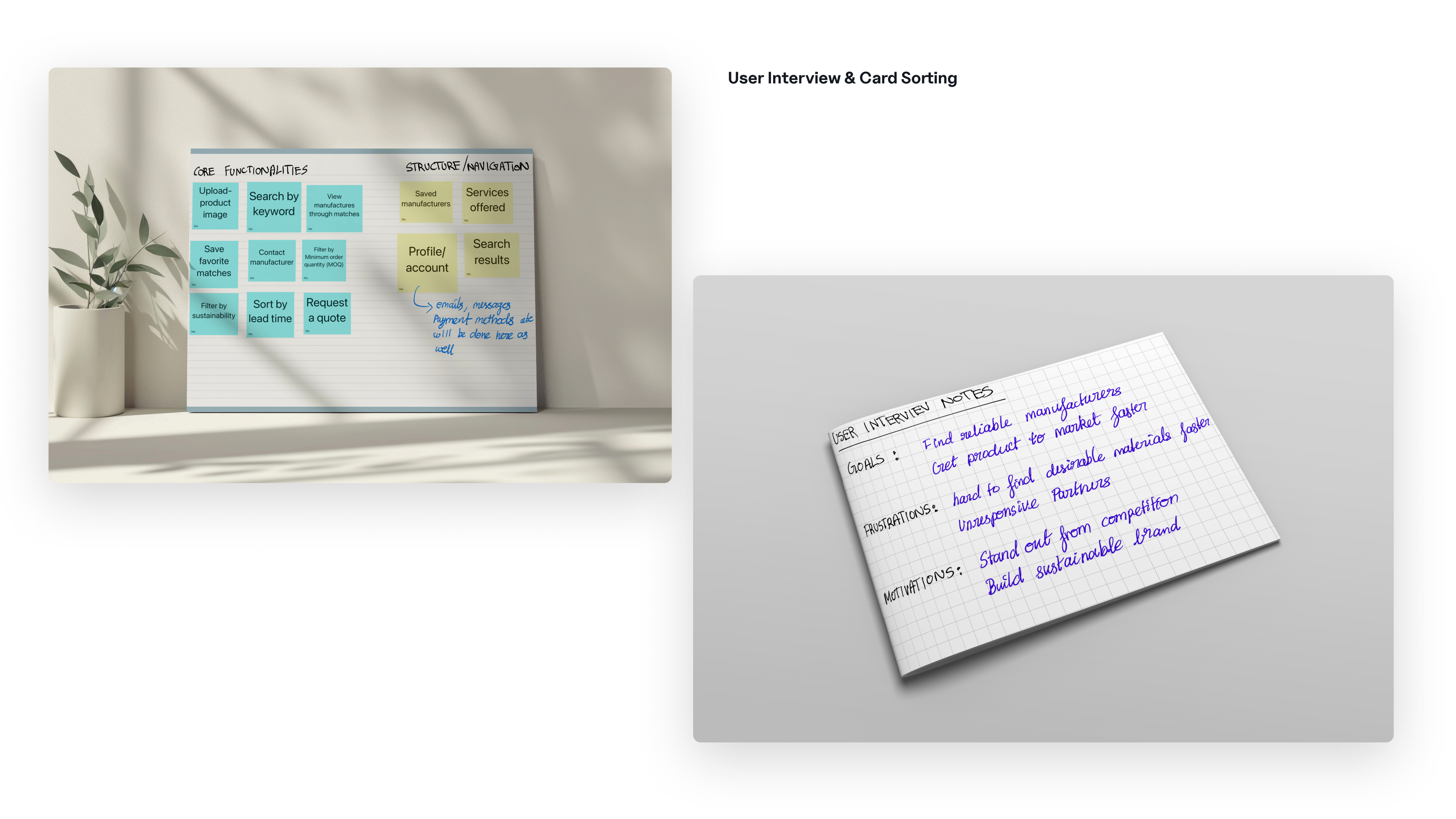
Affinity mapping across twelve sessions. Four friction clusters shaped every design decision after this.
What twelve interviews turned up
Self-reported friction, tagged during affinity mapping across all twelve sessions.
Two moments from the interviews
What we got wrong first
We originally scoped this as a search problem: type what you want, an NLP model matches it to a catalogue. By about week two of interviews I realized that framing was wrong. Founders weren't struggling to search, they were struggling to translate what was in their head into words a factory would actually understand. Search only works if you can name the thing you want, and a lot of them couldn't, which is basically what that first quote above is about.
That meant scrapping the keyword-only version engineering had already scoped, and making image input a real part of search instead of a backup option. My co-designer and I worked through this together, then brought it to engineering with the interview notes attached so it wasn't just our opinion. It turned into three principles that shaped everything after it, which are below.
Three principles came out of that. I kept coming back to them the whole project.
Each one is a direct answer to something specific from the interviews, not a general best practice I pulled from somewhere else.
Meet users where knowledge ends
Accept image uploads and plain language as real inputs, not an afterthought. No manufacturing terms required, since the interviews showed most founders don't know them anyway.
Surface trust, don't assume it
Every supplier card shows certifications, MOQ, and turnaround time, with the AI's confidence level visible and explained. It's basically the direct answer to that $8,000 story above.
Make AI legible
Founders can see why Pomu recommended a supplier. I wanted every AI output to make sense, not feel like magic, because trust shouldn't depend on just believing the algorithm.
Principle one is basically why I designed search first. Here's how it shows up across the flow.
It takes five steps to go from an idea to a manufacturer.
The hard part structurally was figuring out how much to show at each step, enough to build confidence without overwhelming someone who's never done this before. I went through twenty-two lo-fi wireframes across desktop and mobile to make sure the structure actually held up before any color touched it.
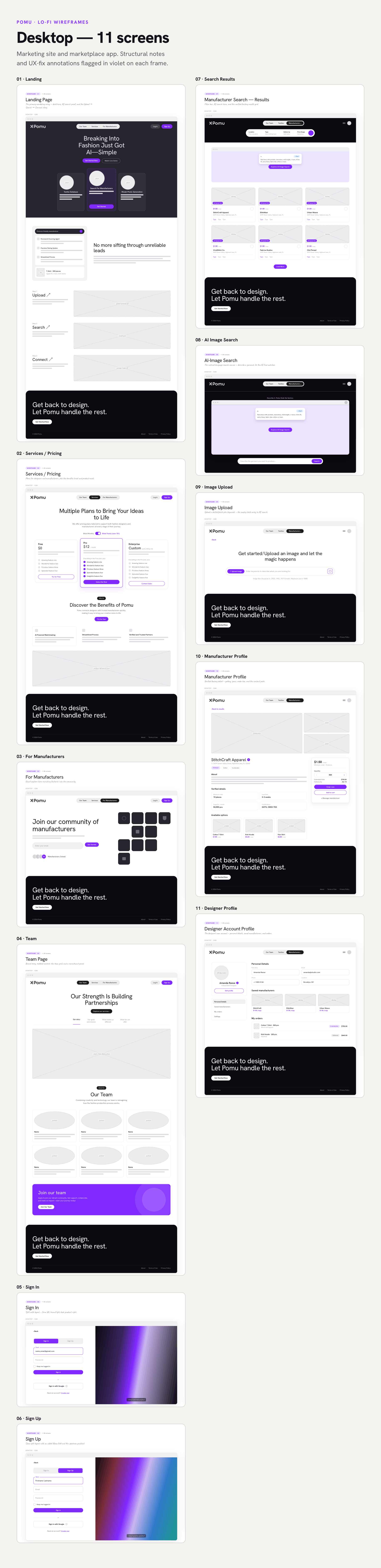
Lo-fi wireframes: the same content model held at desktop and mobile before any visual design began.
Three decisions that shaped this flow
My co-designer and I worked these out together, each of us would bring a version, argue it against the interview data, and merge or kill it from there. Engineering weighed in on what was actually feasible before anything got locked in.
Progressive disclosure
Onboarding only asks for what it needs to seed better AI matches, nothing more than that upfront.
Co-located dual input
Image upload and text live in the same input, so it feels like one search, not two separate features stitched together.
Confidence at every result
Founders can see why something matched before they even click into the profile. Nothing about the AI here is a black box.
I built the whole flow as a real iOS app.
That five-step flow shipped as a native iOS app. You upload a design, Pomu reads it, and you land on a ranked list of verified factories. It's seven screens total, from upload to order confirmation. Pomu isn't active anymore, so this is its last shipped state.
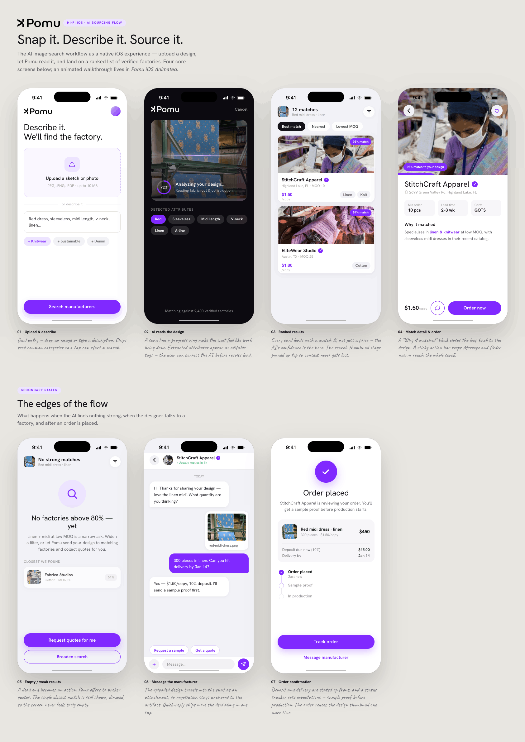
iOS flow: upload and description, AI reading the design, ranked results, match detail, empty state, manufacturer chat, order confirmation.
Upload and describe
You can drop in an image or just type a description. A few category chips are there so a single tap can start a search.
Ranked results, match detail
Every result leads with a match score instead of just a price. A sticky bar keeps Message and Order Now within reach the whole time.
Edge cases and order
Even the empty state gives you something to do next. Order confirmation shows the deposit and delivery timeline right away.
Animated prototype: the full iOS flow from upload to ranked results.
The search interface, the part I led
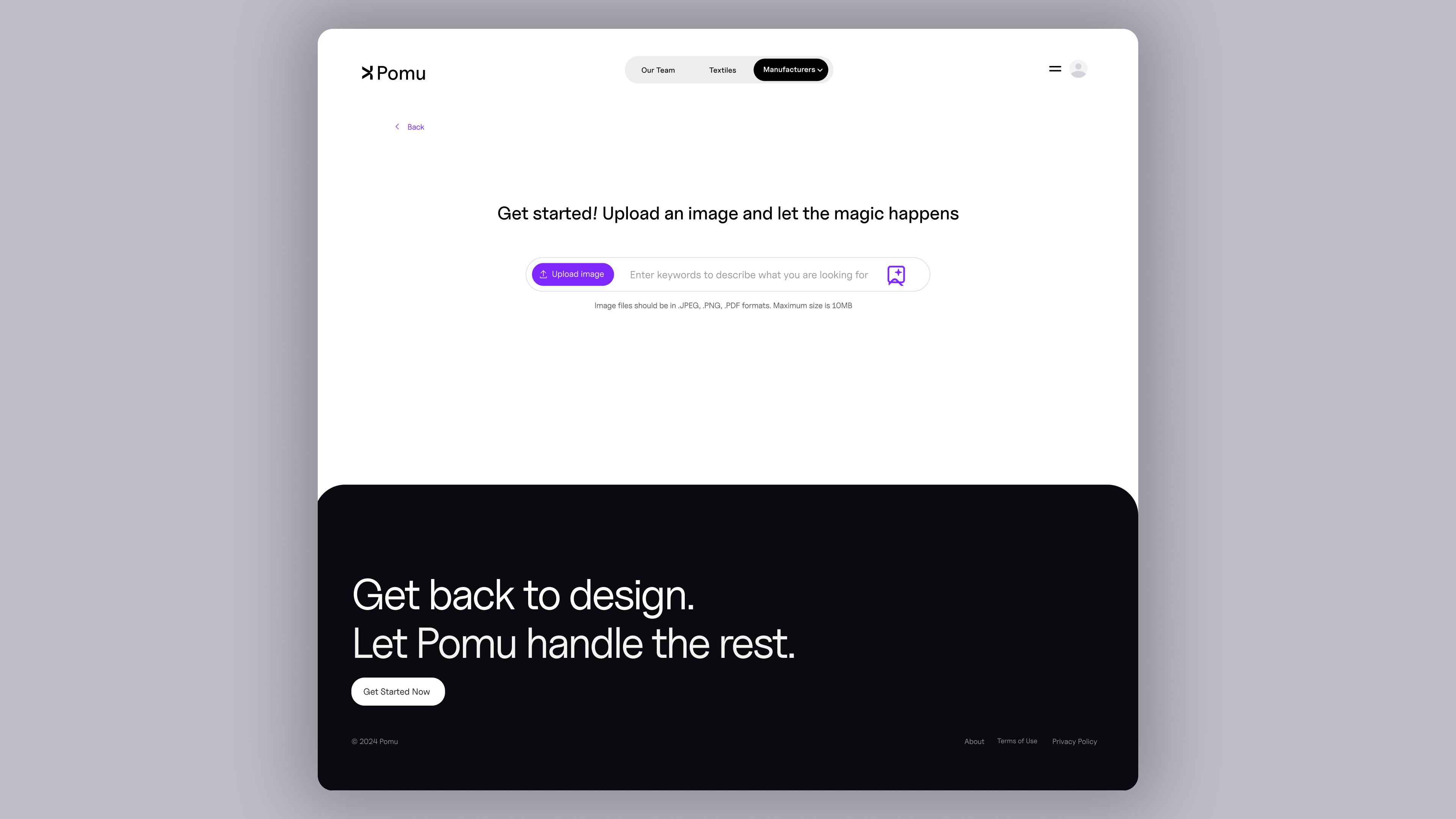

Search and results: co-located inputs, confidence scoring, transparent match reasoning.
Image and text share one input instead of a toggle between modes, which is really just principle one in practice: a founder shouldn't have to decide how to search before they've even started. Match score and the reasoning behind it sit on every card too, so trust and legibility show up right when someone's deciding whether to click into a profile.
Live prototype: onboarding through ranked results with dual-input AI search.
What was actually running underneath all of that.
None of those screens were designed one at a time. Working with three engineers and one other designer, I treated the design system as something the whole team relied on, not just a Figma file sitting off to the side, but the actual source engineers pulled from through Dev Mode. The brand had to work on both ends of the marketplace too, credible to a founder and to a factory at the same time.
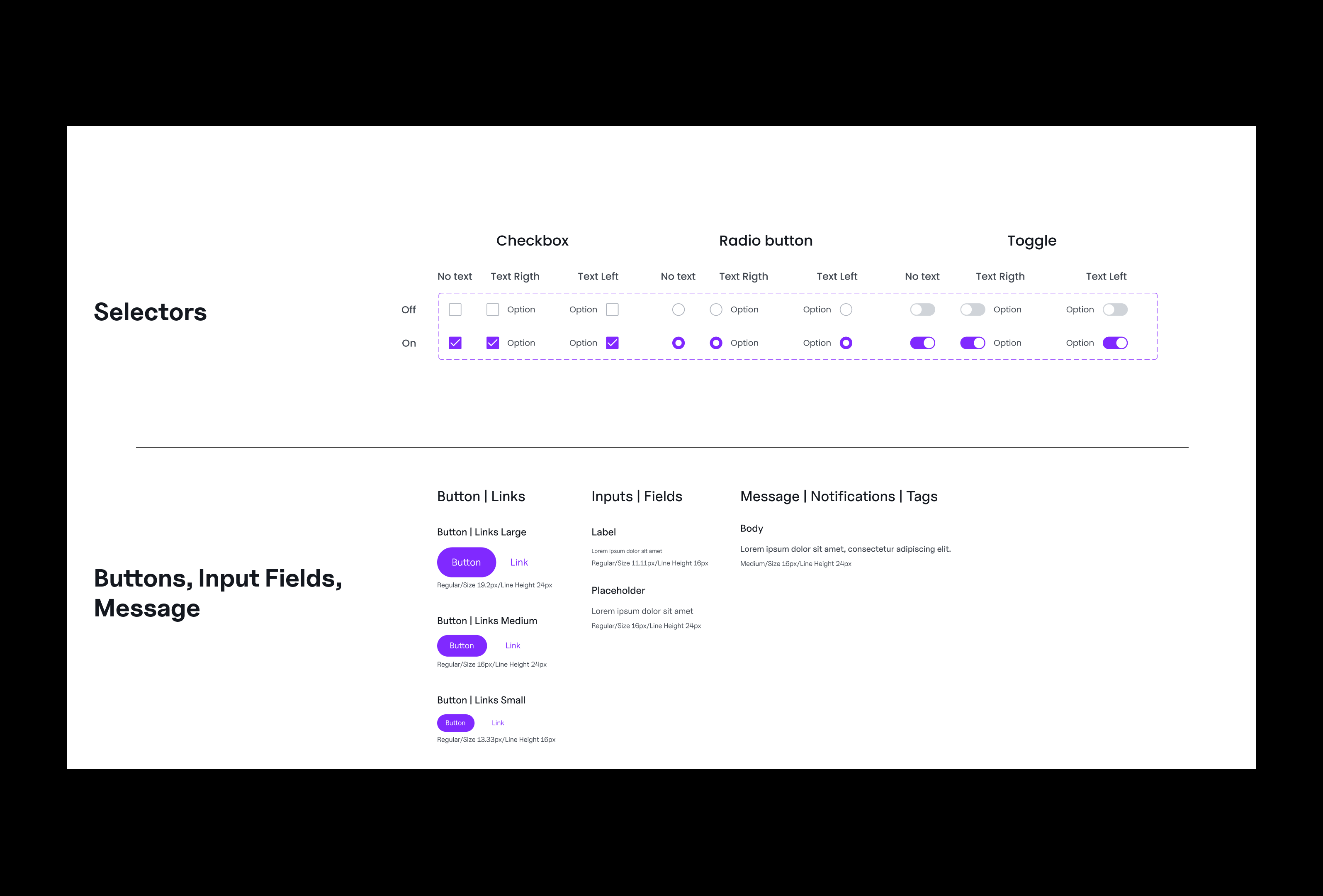
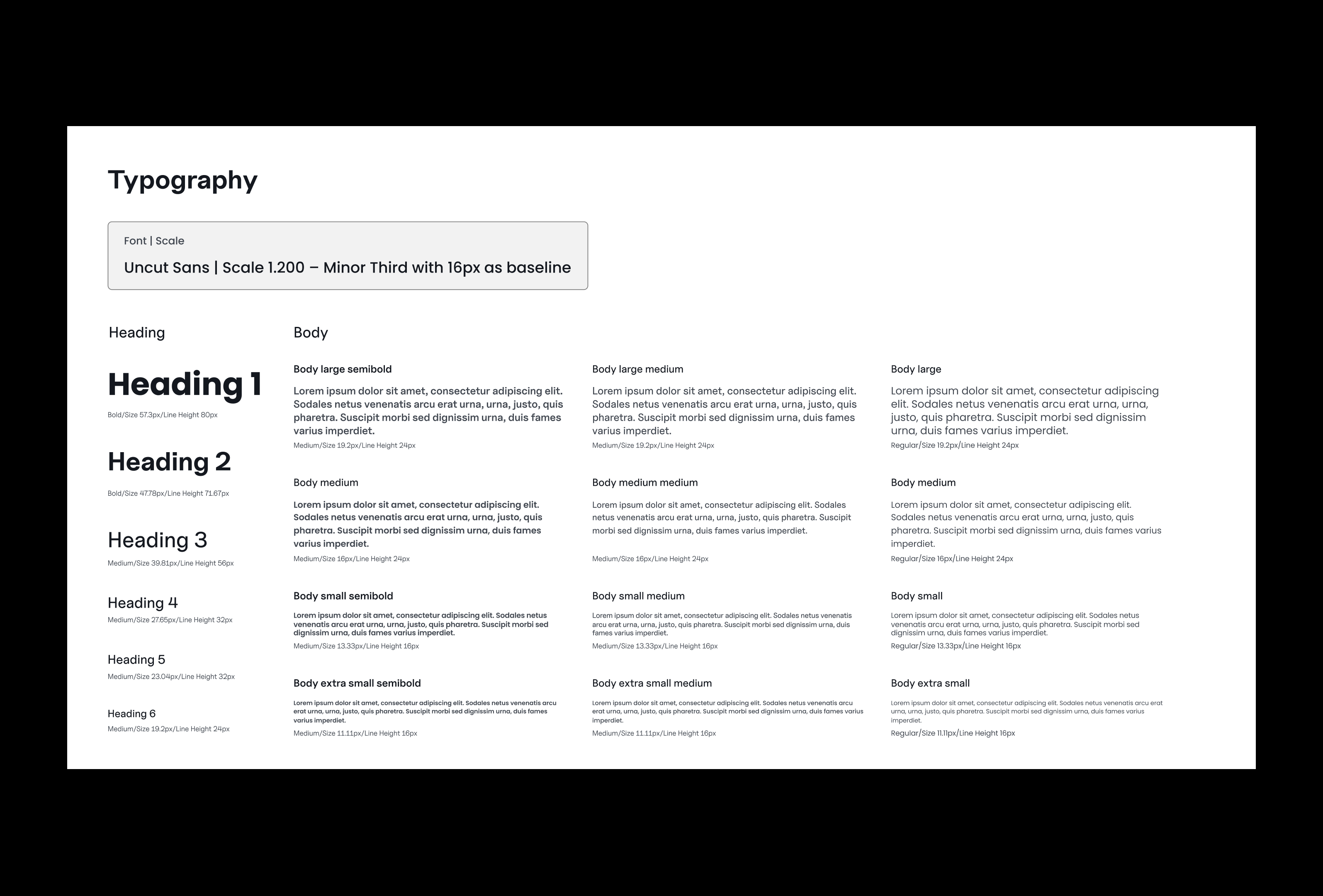
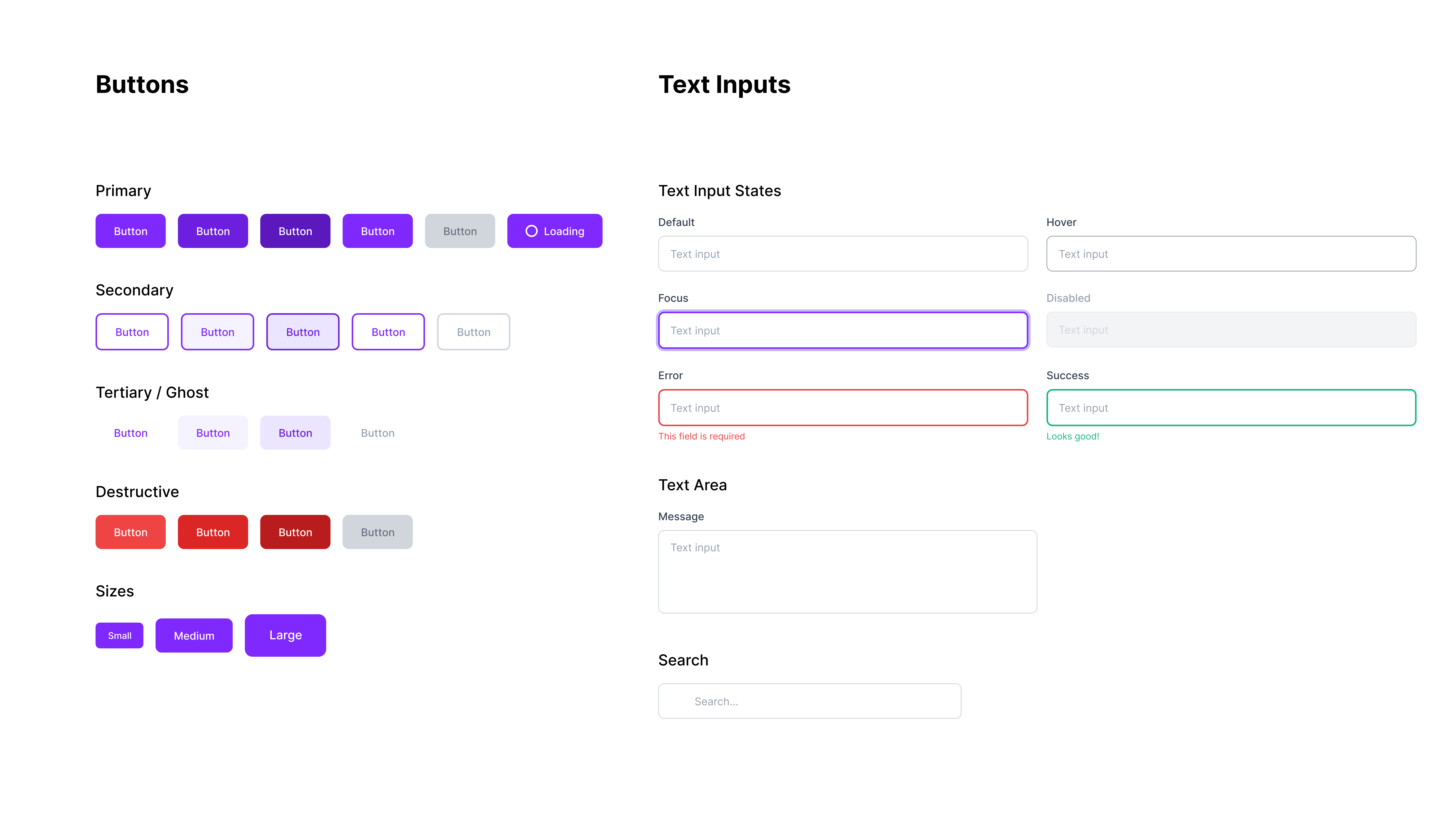
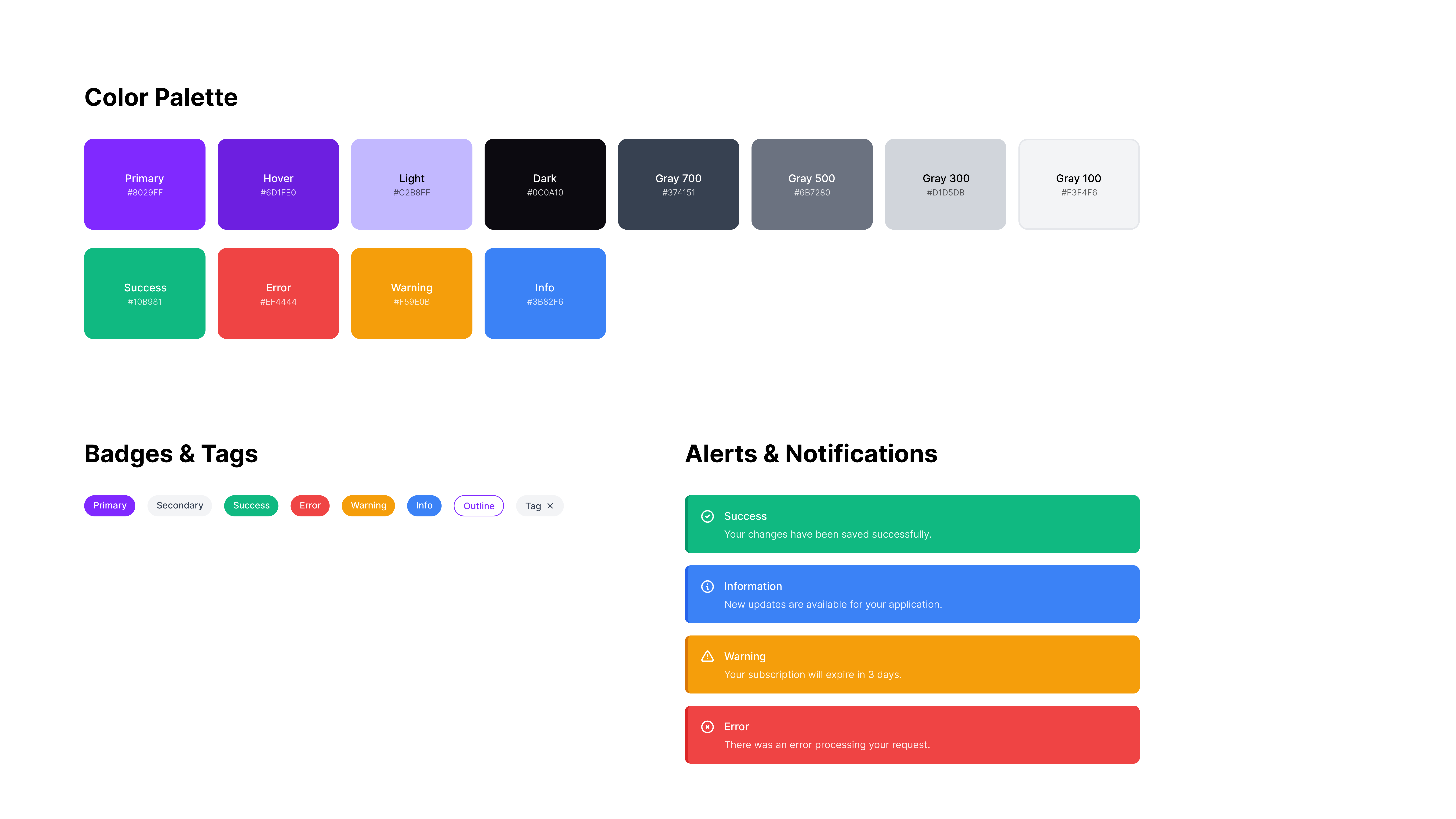
Component library, type scale, documentation, color palette, and grid system.
Pomu had to feel credible to a Brooklyn streetwear founder and professional to a manufacturing director in Hanoi at the same time. I checked every brand decision against both of those people.
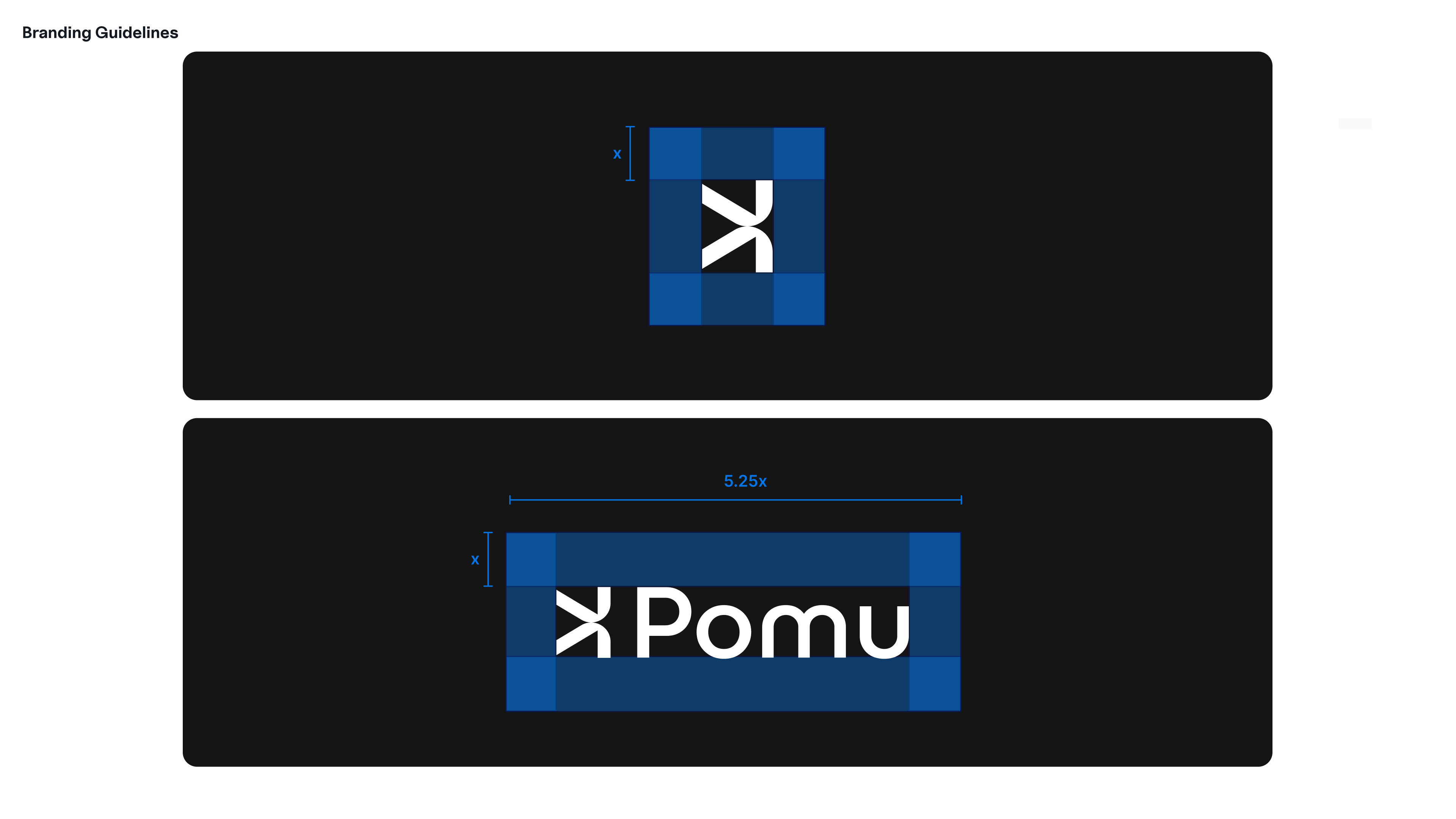
Brand system: logomark, wordmark, and visual guidelines.
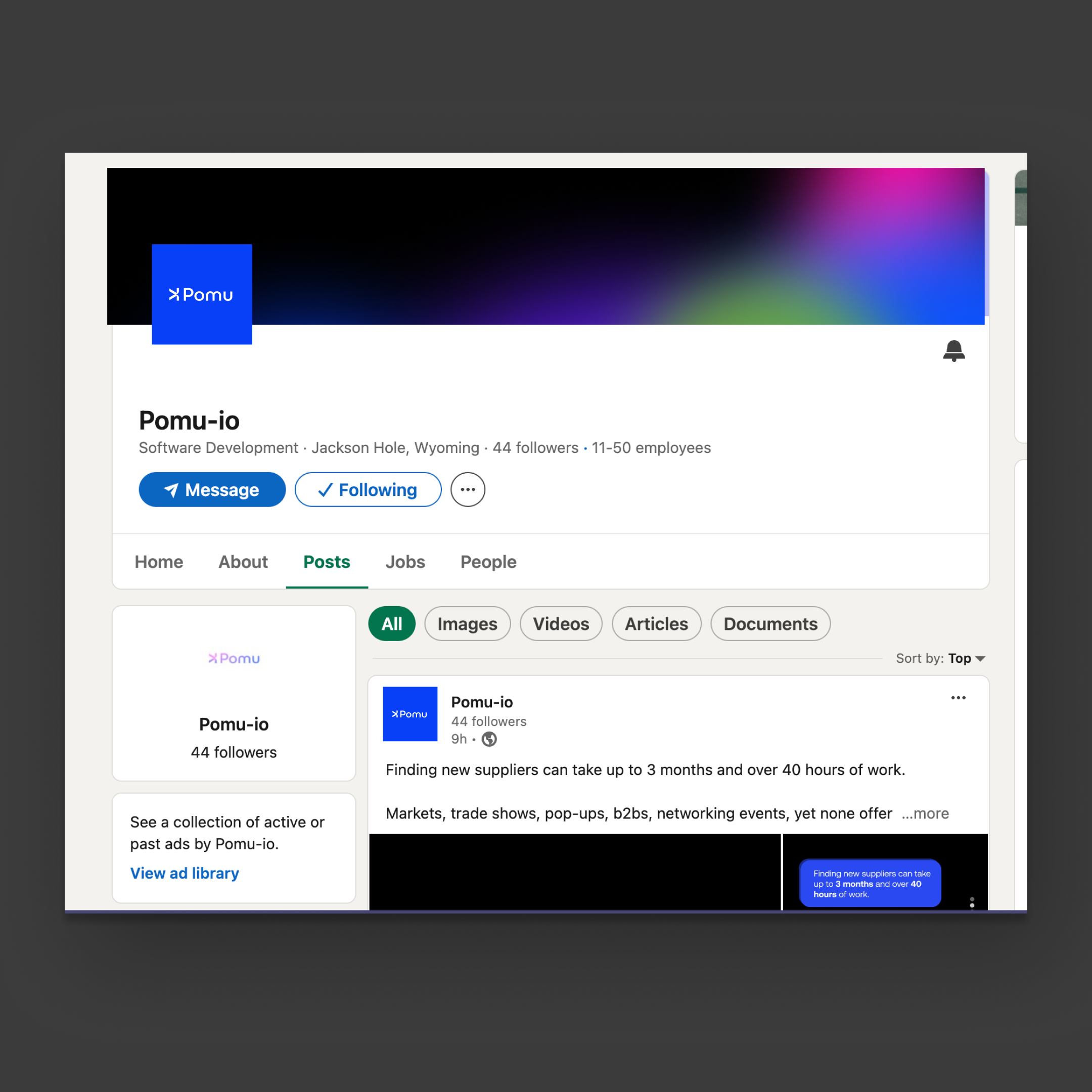

LinkedIn campaign templates: built from brand tokens, publishable without opening Figma.
What actually shipped.
Each of these ties back to something above: the system engineers actually used, the search flow founders used, the legibility principle put into practice.
Zero re-explanation
Three engineers pulled straight from the design system through Dev Mode. No handoff meetings needed once it shipped.
Seven-screen iOS flow shipped
The whole flow, upload through order confirmation, went live on the App Store, built and tested against the same system from day one.
Confidence scores, explained
Every AI recommendation comes with plain-English reasoning attached. That's really the whole point of the make-AI-legible principle.
What zero-to-one taught me.
When you're starting from zero, there's no existing pattern to lean on, so how good your research is basically decides how good your bets are. The hard part isn't coming up with ideas, it's figuring out which one to actually build next. Working inside an AI pipeline also changed how I design. The model could only do what it could do, so my job became translating that into something a founder could actually trust, and that's something I think about on every AI product now.