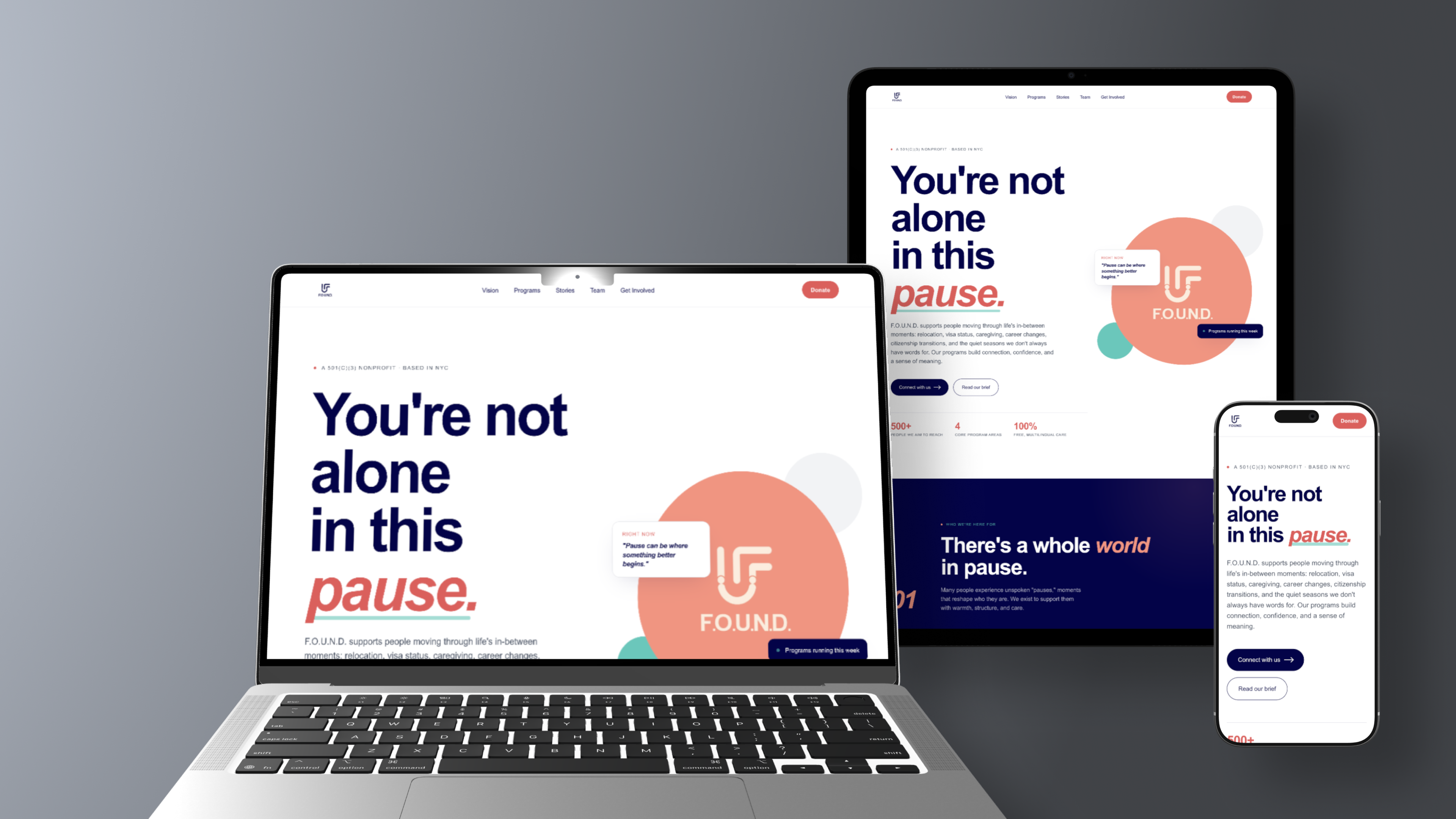
Their own site didn't explain what F.O.U.N.D. actually does.
I joined F.O.U.N.D. as a product designer. As the scope grew into a full brand system, a site rebuild, and templates across platforms, I got promoted to lead the rebrand. At that point my job stopped being about making things and became more about deciding how things got made.
Who F.O.U.N.D. actually serves
There are four groups, and I wanted real numbers behind them instead of vague categories. "People going through something hard" isn't specific enough to actually design for.
Dependent visa holders
Of H-4 visa holders are women, many waiting years to be legally allowed to work. Know-your-rights sessions and peer mentors for that specific limbo.
Long-term caregivers
Americans providing unpaid care, often putting their own lives and goals on hold. Respite circles and a resource library made room for them.
Returning migrants & trailing spouses
Often facing identity dislocation and an unclear next step. Peer circles and local resource maps to help them find footing again.
Recovering from burnout or transition
Seeking clarity, reinvention, and support at their own pace. Skill workshops and mentorship for whenever they're ready to restart.
None of that came through on the old site. Here's what the audit found.
I tested three visitor types, and all three got lost within seconds.
I walked through the old site pretending to be three different first-time visitors: someone looking into a program, a potential volunteer, and a small donor. Each of them wanted something different. The site failed all three the same way, eight different type styles that didn't match, navigation you had to guess at, and no clear next step anywhere.
That thirty-second test became the bar every decision after this had to clear, especially the site's structure, which I'll get to in a few sections.
One set of decisions, used everywhere the org shows up.
The brand couldn't just look good on a homepage. It had to hold up across a hand-coded site, ten-plus social templates, and whatever a non-designer on the team ended up doing with it later. So I treated it like a system first, decoration second.
Each color has one job, and it doesn't change whether it's on the web, in social, or in print. Peach carries emotion. Navy carries weight. Teal and coral mark specific moments. Cream softens everything in between.
A U meeting an F
It's two figures meeting at one point, which is basically the moment someone finds someone else. It holds up from a tiny favicon to a billboard.
One typeface: Arial
It works on every device, there's no licensing cost for a nonprofit, and it never blocks on a font failing to load. Honestly more of a product decision than a brand one.
There are ten-plus templates across Instagram, LinkedIn, and Threads. Every one uses the same colors, type hierarchy, and logo placement. The team posts straight from these now, no designer has to touch the file.
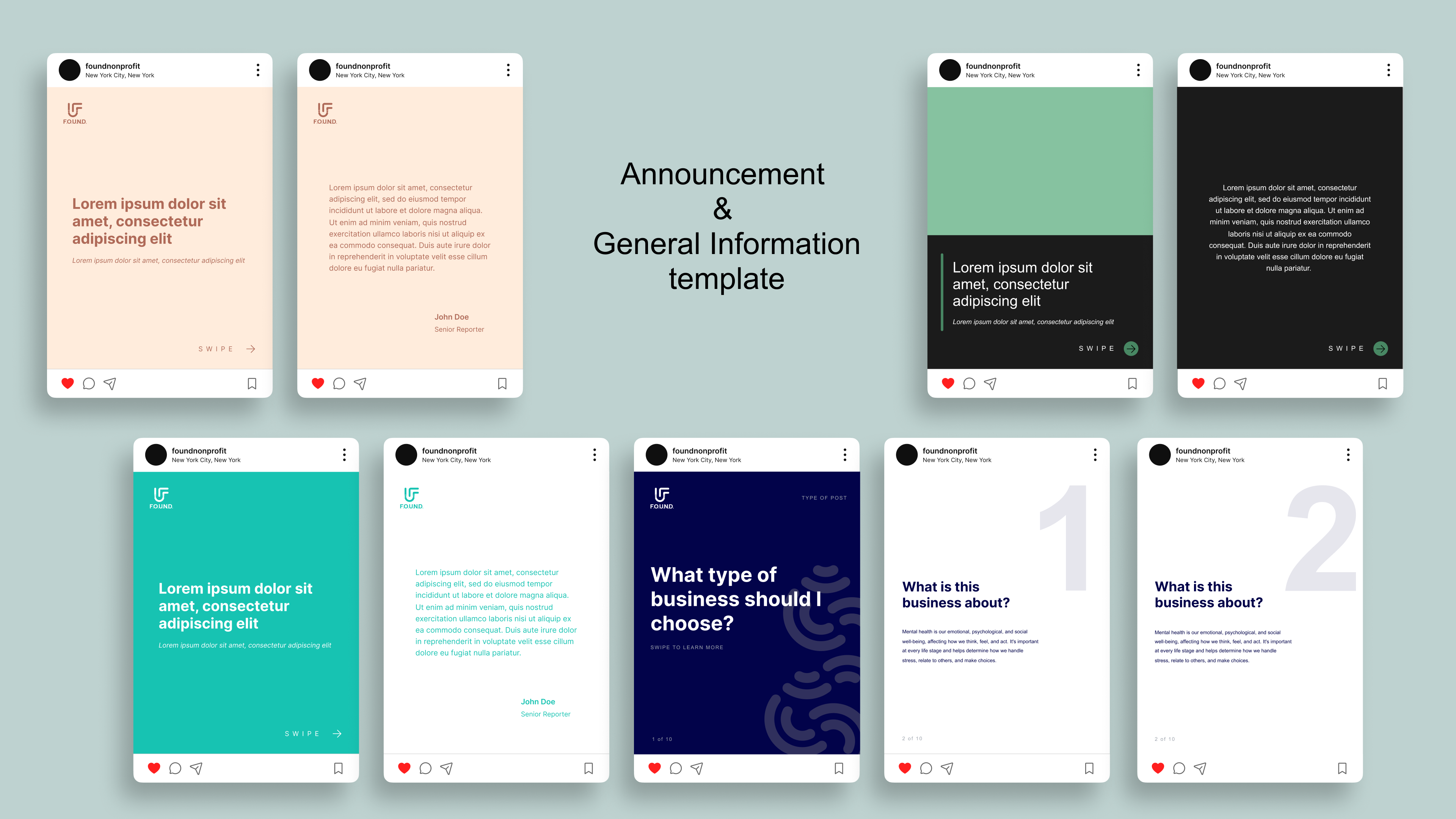
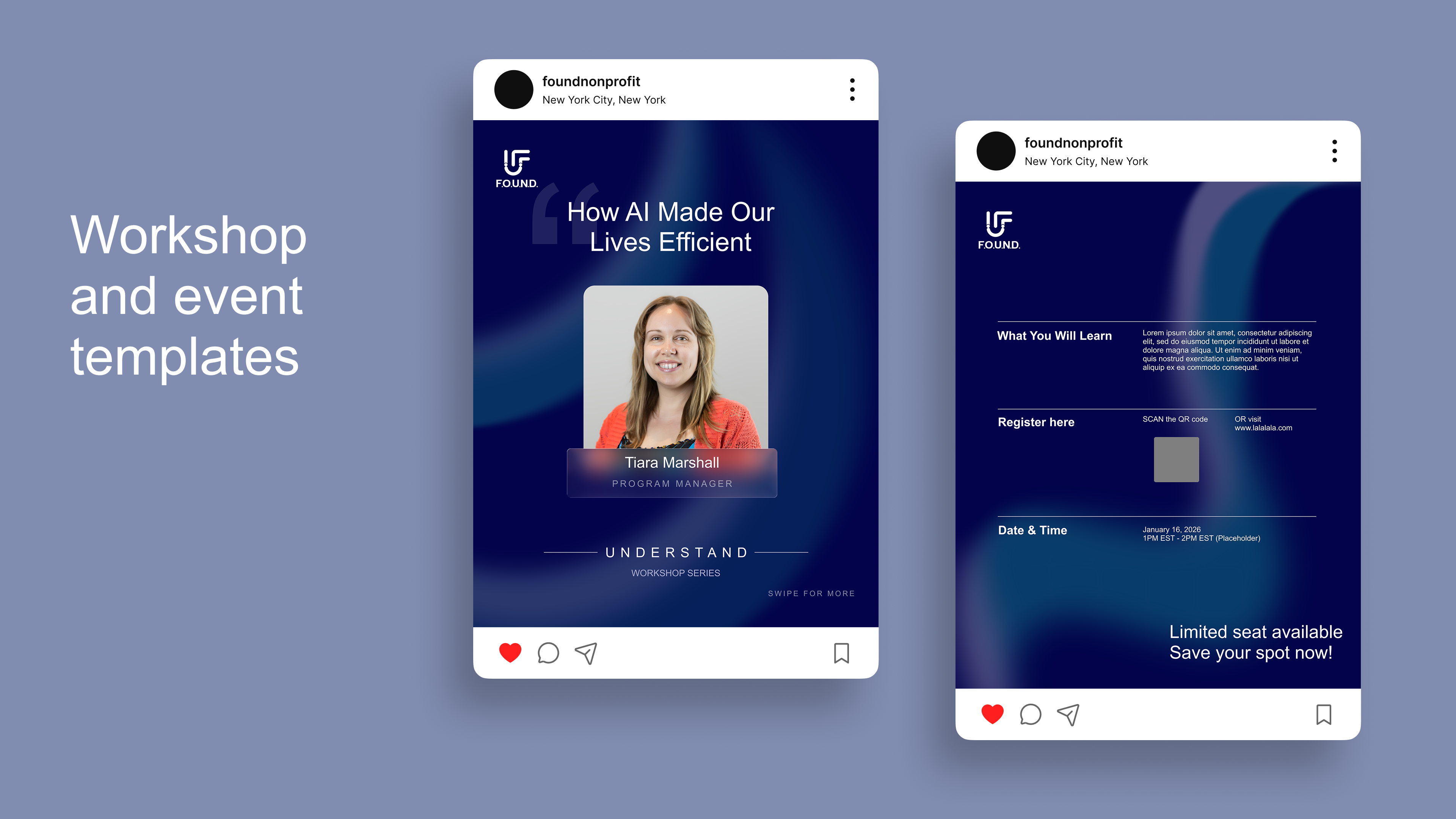
Instagram templates, built from brand tokens, publishable by anyone on the team.
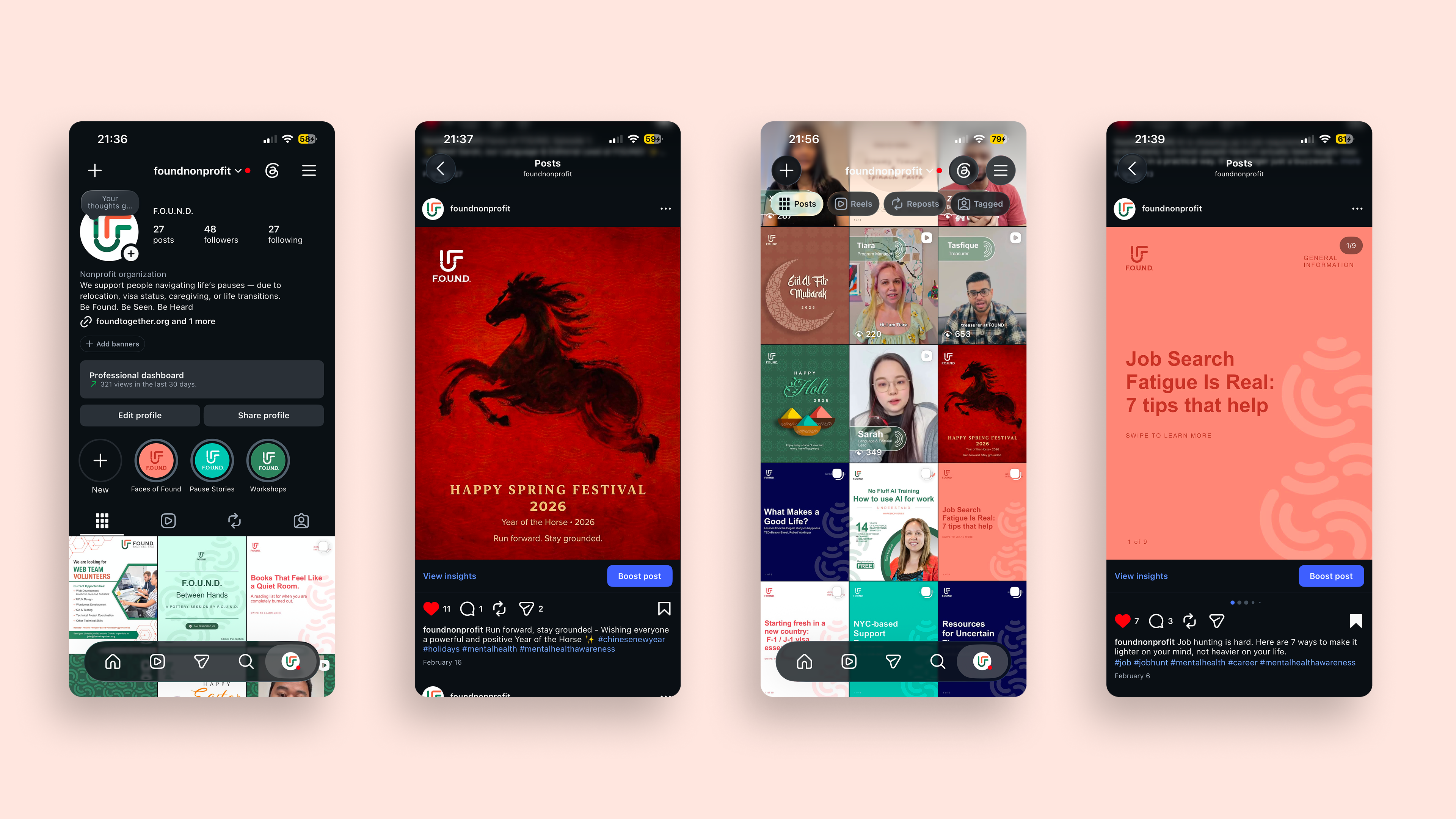
The current Instagram page, showing the rebrand and content voice in production.
That system is what let the site's structure actually get built fast. That's next.
The homepage has six sections that build one argument.
The order of sections is basically an argument. Orient, reframe, help visitors see themselves, show the work, offer proof, convert. Every step was a guess about how a stressed, time-poor visitor actually reads a page, and I tested each guess against that thirty-second standard from the audit.
That structure turned into the actual pages, which is next.
I designed it, coded it, and shipped it.
I hand-coded it in HTML, CSS, and vanilla JS, and deployed it on Netlify. The design and the build were basically the same process for me. Every responsive decision only had to get made once, by the person who owned the whole thing.
.png)
The five core pages at a glance: Home, Who We Serve, About Us, Programs, and Stories, sharing one visual system.
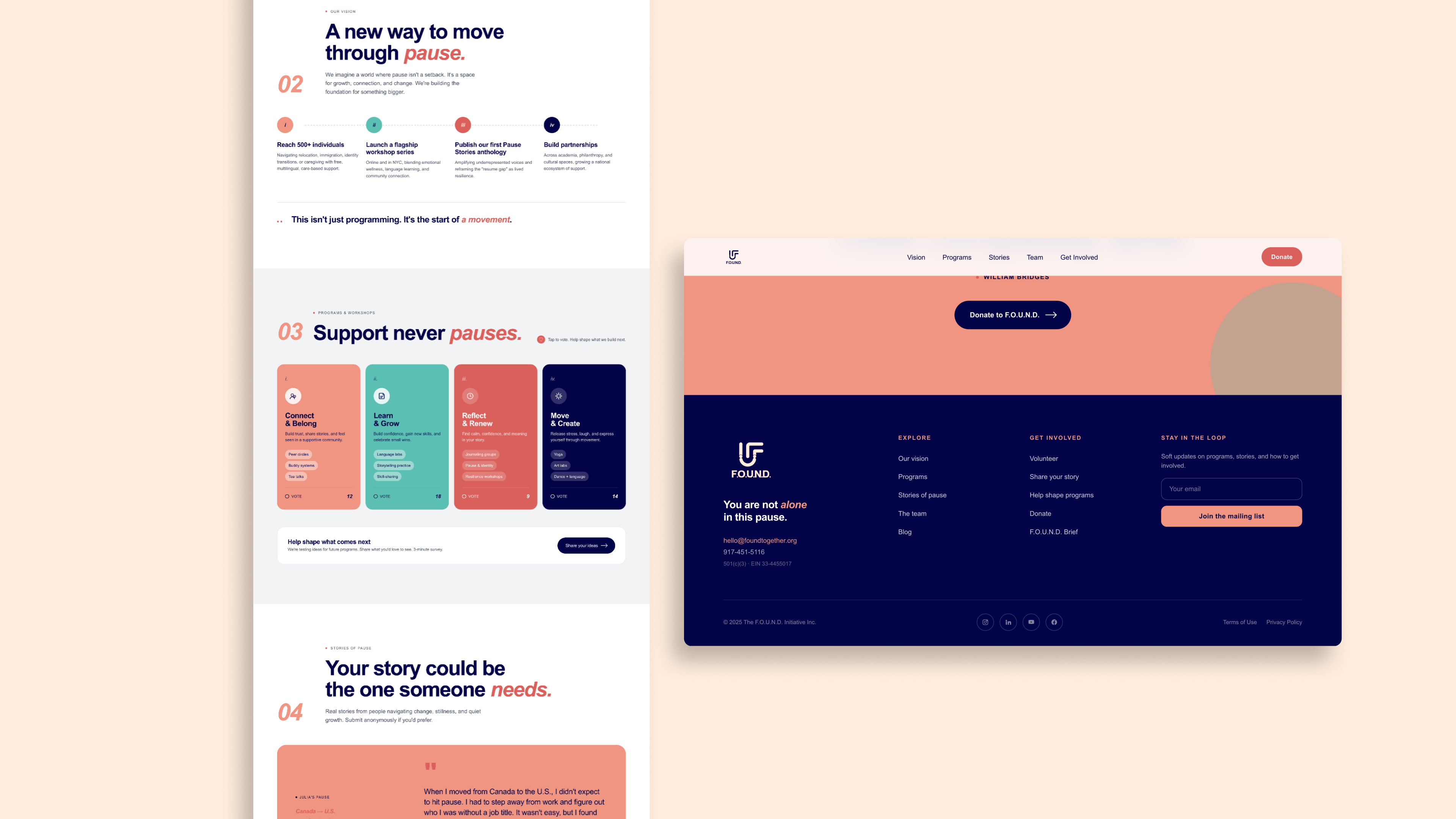
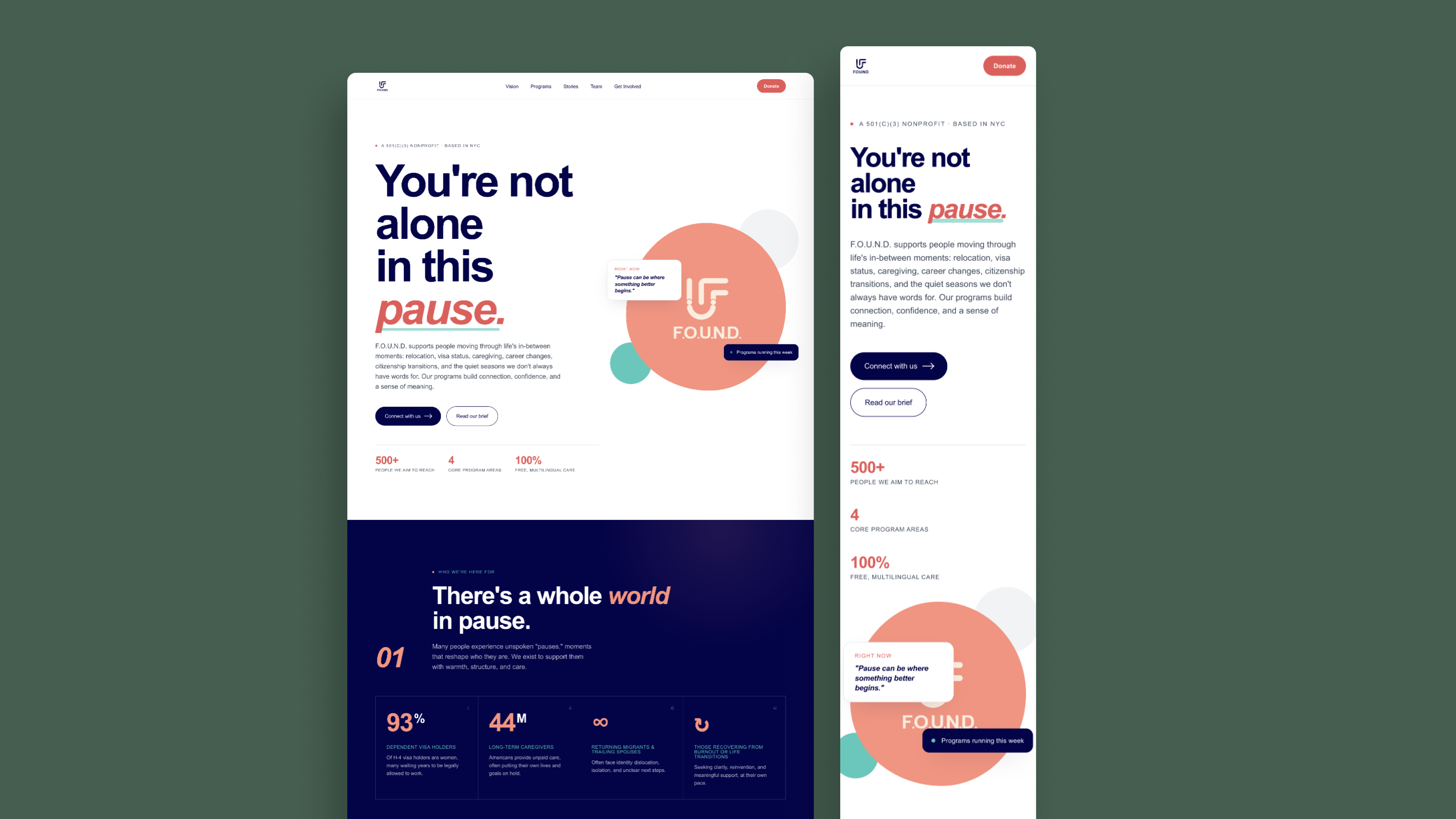
Desktop, tablet, and mobile, built mobile-first since most visitors mid-transition are checking this from a phone.
Sticky navigation
It condenses as you scroll, but the three main paths, participant, volunteer, donor, are always within reach.
Scroll-triggered reveals
Content comes in as you scroll instead of loading all at once, so the page doesn't feel front-loaded.
Persona-first "who we serve"
Visitors pick which group they're in before they even see a program name. That's straight from the structure decision above.
White space as a design move
Peach only shows up at emotional moments, then gets out of the way. Every color does its one job and stops there.
None of that matters much without knowing what happened after it launched.
What actually moved.
These numbers are small on purpose. This is a volunteer-run nonprofit, not a venture-backed startup, so the direction matters more than the size. What it proves about the system behind it matters even more.
15 → 50 followers
Instagram growth in the 4 to 5 months following the rebrand, the org's first real social presence.
+20% engagement
Lift across posts on the new template system versus the prior ad hoc posting.
Designer to Lead
Promoted mid-project to own the rebrand end to end.
The website is still being finished by the team, and I'm not part of it day to day anymore. The templates are already the org's actual publishing tool though. I think that's the real test of whether a system works, it didn't stop just because I left.