A secondhand luxury marketplace where users abandoned with clear intent. I ran end-to-end research, diagnosed the failure points in the search and filter system, and redesigned the mobile experience — cutting task completion time by 60%.
Known Source serves buyers who arrive with specific, high-intent queries. A vintage Chanel blazer in size 6. A Bottega Veneta bag in a specific colorway. These aren't browsing sessions — they're searches with clear criteria. The failure wasn't inventory. It was friction between user intent and the interface's ability to act on it.
High bounce rates and low conversion weren't random. Every friction point was traceable to a specific interaction breakdown in the search and filter system.
Fig. 2 · Current state journey map — annotated friction points across the existing mobile search flow. Red annotations mark confirmed drop-off zones from analytics and session observation.
Fig. 3 · Friction map of the existing experience. The filter system at step 3 accounted for the largest observed abandonment — 55% of participants in early testing gave up at this point.
I conducted and analyzed moderated usability testing with six participants from Known Source's target demographic — resale buyers aged 22 to 38 with prior experience on luxury secondhand platforms. Each session ran 40 minutes around the same core task: find a specific item and apply three filters you'd use in a real purchase decision.
I coded session recordings using thematic analysis, then mapped findings to interaction touchpoints. The data converged on three failure categories that explained virtually all observed friction.
Fig. 4 · Research synthesis — affinity mapping from six participant sessions. Three failure categories drove virtually all observed friction.
In addition to the shared research effort, I owned a full WCAG 2.1 accessibility audit of the existing mobile experience. This added a layer of evidence the team hadn't surfaced through observation alone — many of the friction patterns users described verbally had quantifiable technical roots.
Fig. 5 · Accessibility audit findings — six WCAG 2.1 violations identified across touch targets, contrast, focus management, and semantic structure. All six were resolved in the redesign.
Applied filters must remain visible throughout the results view. Users need to know what's active without scrolling back to the filter panel. Persistent pill UI with one-tap removal.
Collapse three scroll levels into one. The filter interaction should feel like a sidebar, not a journey. Every filter option reachable within two taps from search results.
44px touch targets on all interactive elements. 4.5:1+ contrast on all text. ARIA labels on state changes. Keyboard-navigable modals. Every violation found in the audit resolved.
The core design challenge was the filter system. We prototyped three distinct patterns and tested each with participants from the original research group before committing to a direction.
Fig. 6 · Filter pattern comparison — three variants tested with participants. The hybrid approach (Variant C) gave users speed for frequent filters and depth for advanced ones without requiring a context switch.
Users needed two different speeds depending on the filter. A buyer filtering by brand — which they do on nearly every session — wanted it reachable in one tap without any modal. A buyer filtering by a combination of authentication status, seller rating, and price range was willing to open a drawer.
The hybrid satisfied both without compromising either. Quick-access horizontal pills for the four most-used filters. A persistent "All filters" drawer for everything else. Applied filters shown as removable pills directly below the search bar — visible at all times, regardless of scroll position.
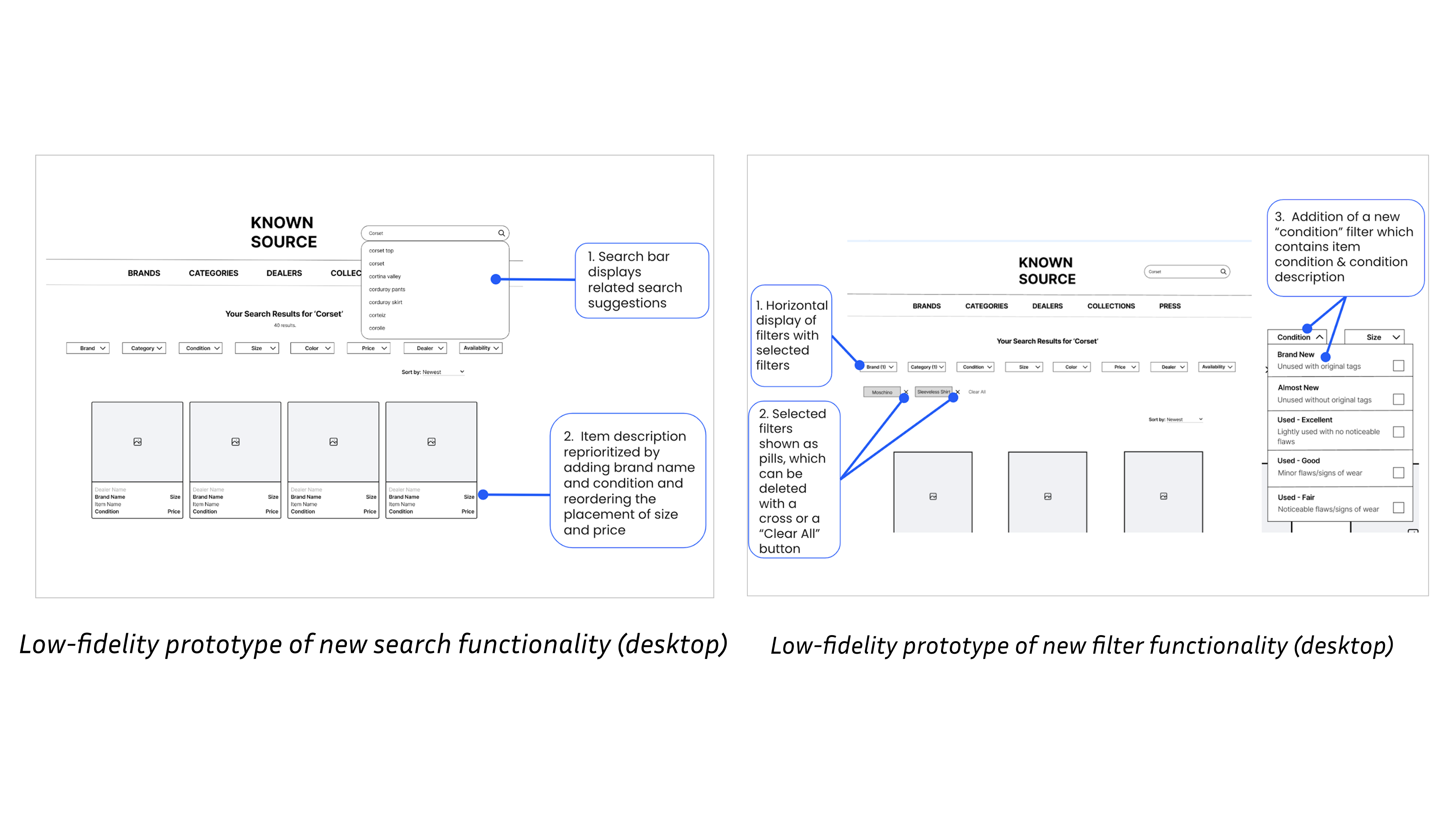
Fig. 7–8 · Wireframe iterations — testing horizontal vs. modal vs. hybrid layout across three rounds. Annotations show which decisions each test informed.
Every high-fidelity decision maps directly to a research finding. 44px touch targets replacing the 28px originals. Active filter pills that persist through scroll. Bottom sheet filter drawer instead of full-screen modal. Semantic grouping with visible category labels. Contrast ratios verified at 4.5:1 minimum across all text.

Fig. 9 · High-fidelity mobile screens — final hybrid filter system with persistent pill active states, bottom sheet drawer, and touch-optimized interaction targets throughout.
We ran comparative usability testing against the existing Known Source experience with five participants drawn from the original research cohort. Each completed the same task on both the original and redesigned prototypes, with order counterbalanced to control for learning effects.
Task: Search for a corset top and apply three filters you would use in a real purchase decision.
Participants rated agreement with four statements on a 1–5 scale. Ratings were collected for both the existing and redesigned experiences within the same session.
| Statement | Before | After | Change |
|---|---|---|---|
| Easy to find what I'm looking for | 2.5 | 4.3 | +72% |
| Filters are intuitive to use | 2.0 | 4.5 | +125% |
| I understand which filters are active | 1.8 | 4.8 | +167% |
| Search results match what I was looking for | 2.3 | 4.0 | +74% |
The largest single improvement — 167% — was on filter state comprehension. Persistent pills directly addressed the most-cited frustration from every prior session.
Fig. 10 · Task completion time comparison — average task duration dropped from 4:20 to 1:44 across five comparative usability sessions. The filter redesign was the primary driver.
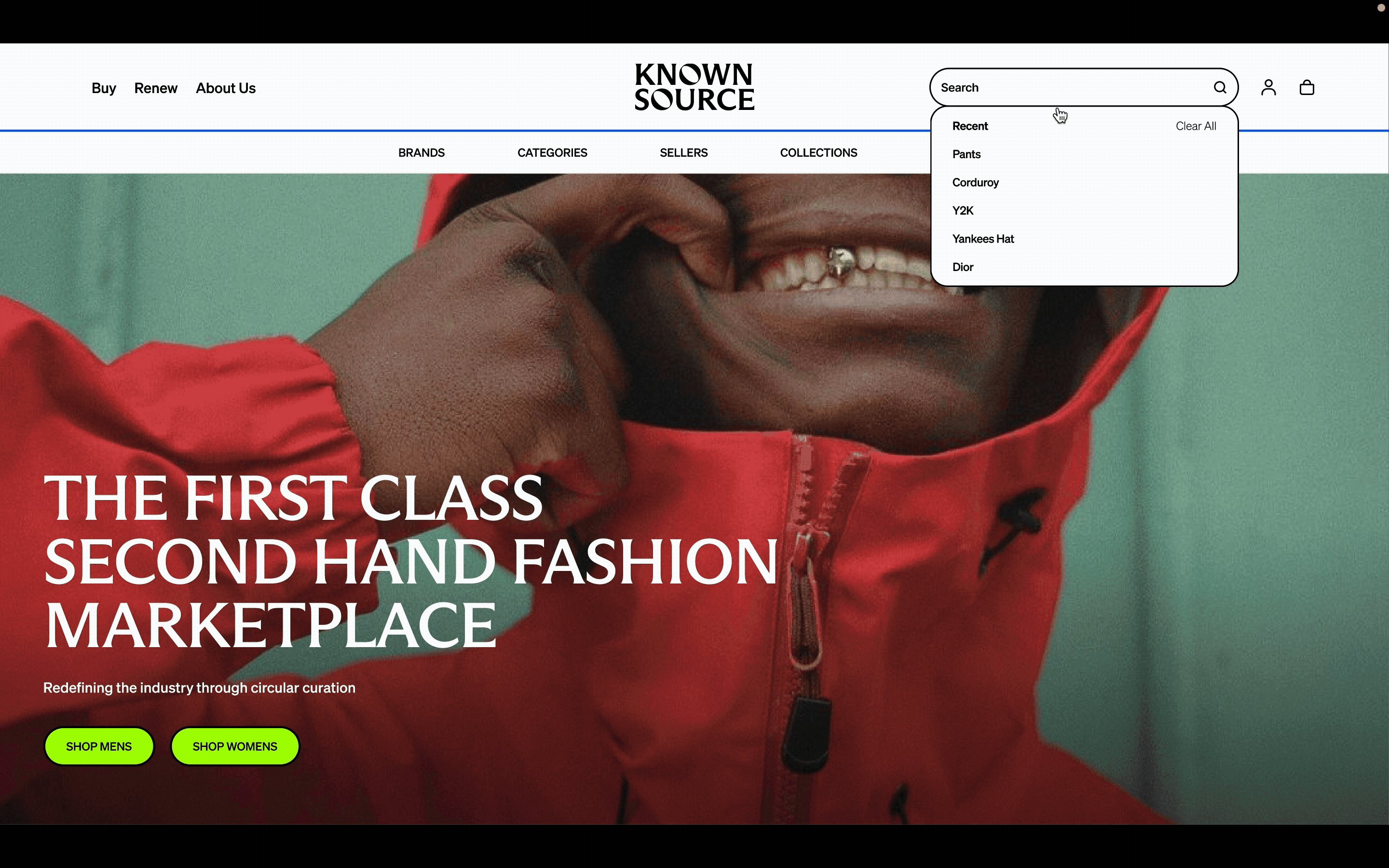
Fig. 11 · Final prototype walkthrough — redesigned mobile search and filter experience with hybrid filter system, persistent pills, and accessibility-compliant touch targets throughout.
The 167% improvement in filter state comprehension came from one specific intervention: persistent filter pills that didn't disappear on scroll. That fix was directly traceable to a finding from the first research session. The research didn't inform the design — it specified it. That precision is what good mixed-methods research enables.
Running the accessibility audit alongside usability testing revealed something important: many "user experience" problems have quantifiable technical roots. A filter that users called "confusing" had a contrast ratio of 2.8:1 against a 4.5:1 requirement. The usability session gave us the behavior; the audit gave us the mechanism. Both were necessary to design the right fix.
The constraint from SEO — which required certain URL structures — initially felt like an obstacle to the search redesign. Working within it taught me that business constraints are part of the design problem, not exceptions to it. The hybrid filter system worked with the URL structure rather than against it.