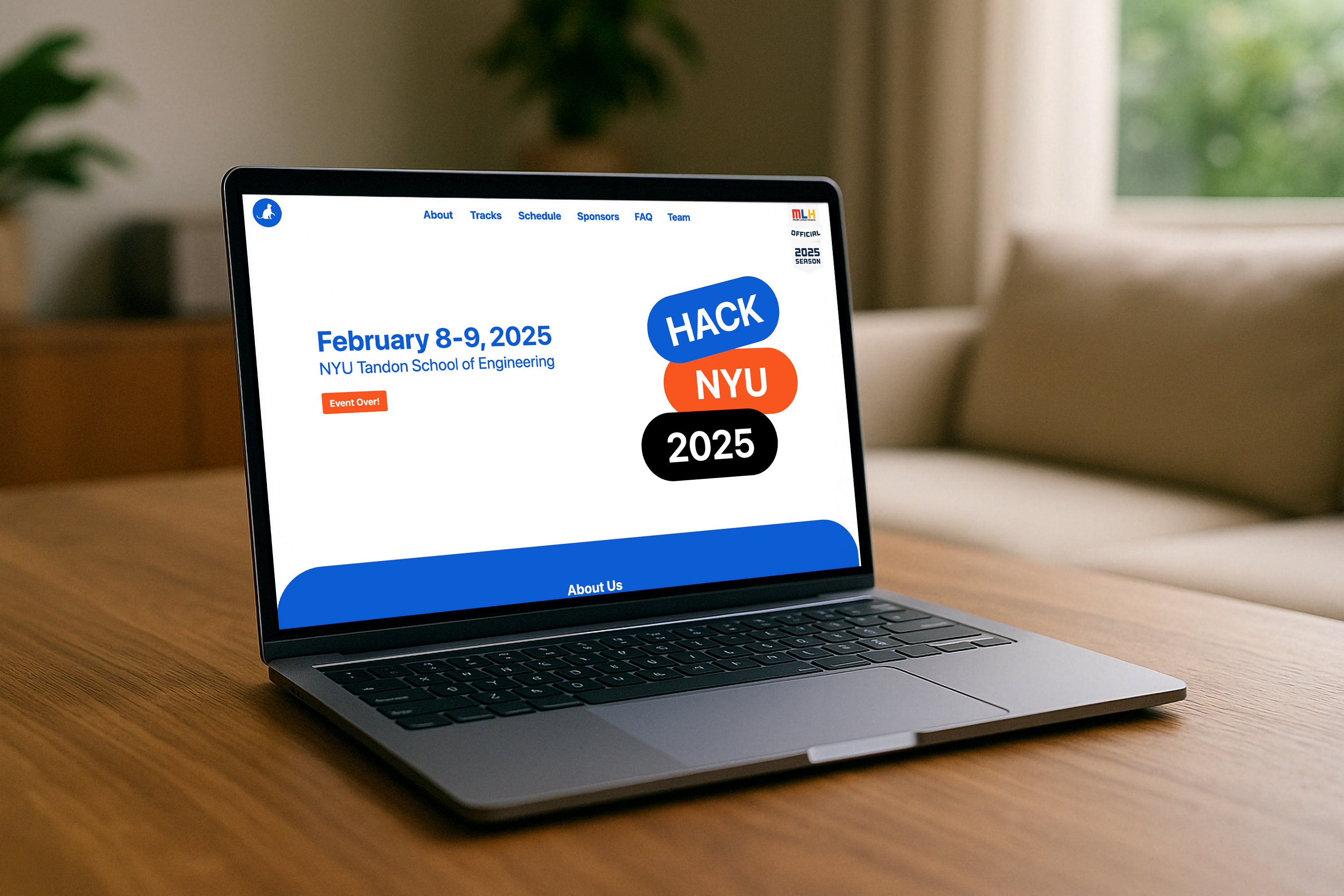
A brand built to survive 600 people and 48 hours.
HackNYU is NYU's flagship hackathon, a 48-hour sprint where hundreds of students, engineers, and designers build under pressure. The brand had to work at hoodie scale and badge scale, on Instagram and on a vinyl banner. Most brand systems fall apart when the format gets extreme. This one held.
I owned the brand end to end, from the first Instagram post that drove registrations to the tote bag someone's still carrying on the subway. Every touchpoint, one visual language.
The designs became coveted items, participants collecting stickers and proudly wearing merchandise long after the event.
Three phases. No wasted exploration.
Concept development
Themes grounded in innovation, collaboration, and NYU's spirit. Generic tech aesthetics ruled out from day one.
Multi-surface exploration
Every direction evaluated against the full asset list. If it worked on Instagram but died on vinyl at six feet, it was out.
Production-ready refinement
Stakeholder feedback and vendor constraints together: print specs, bleed requirements, fifty-plus sponsor logos.
Merch participants actually wanted to keep.
Hackathon apparel has a reputation for being generic. The goal was designs that felt specific to HackNYU, pieces someone would wear not because they had to, but because they wanted to signal they were there.
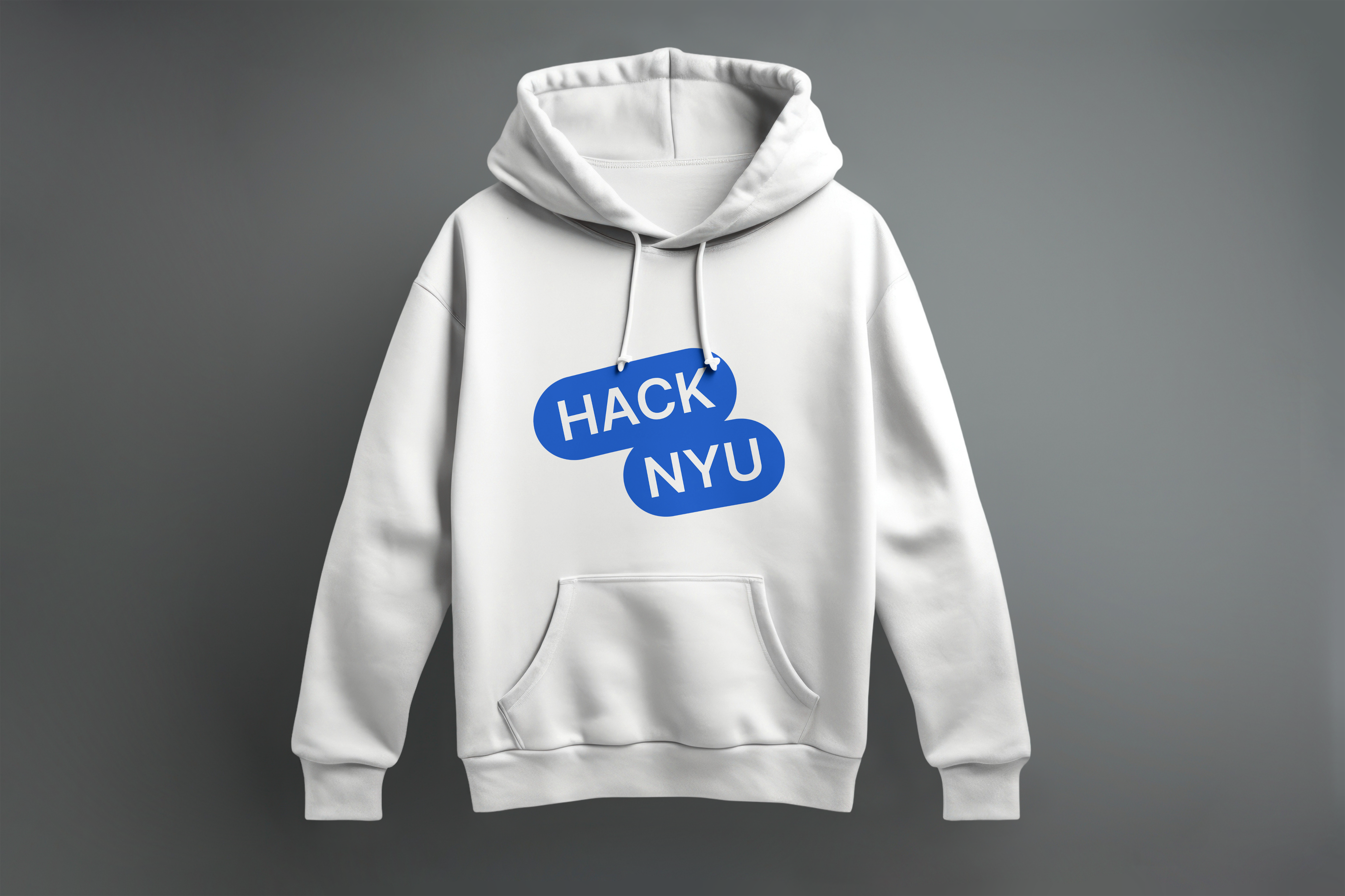
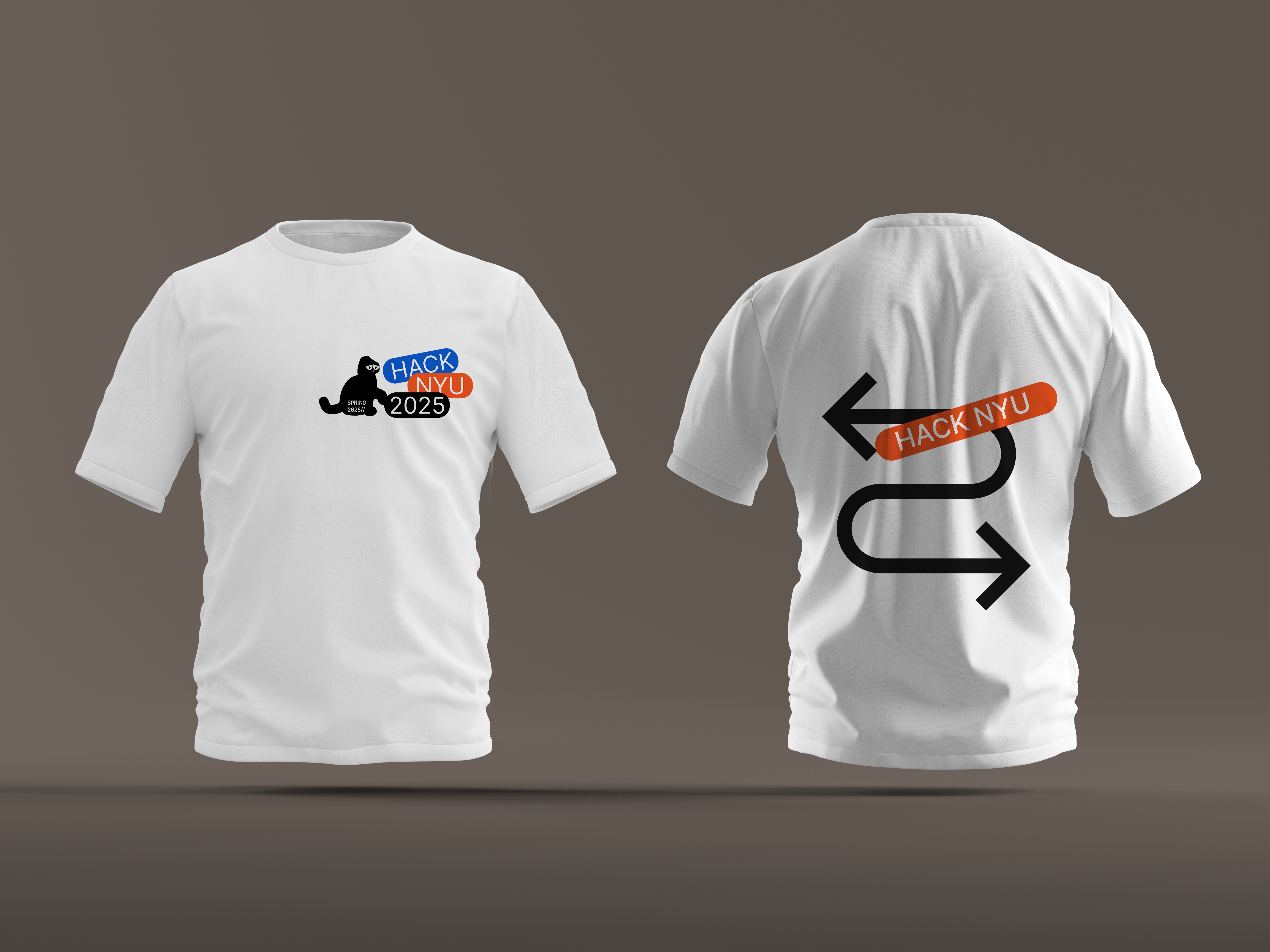
Hoodie and T-shirt, front and back compositions designed to read at distance and hold up in motion.
The collectibles people actually collected.
Two distinct sticker sets, cohesive in system, different enough to be worth collecting both. Badge and ID card worn for all 48 hours, functional, visible, and on-brand at every moment.
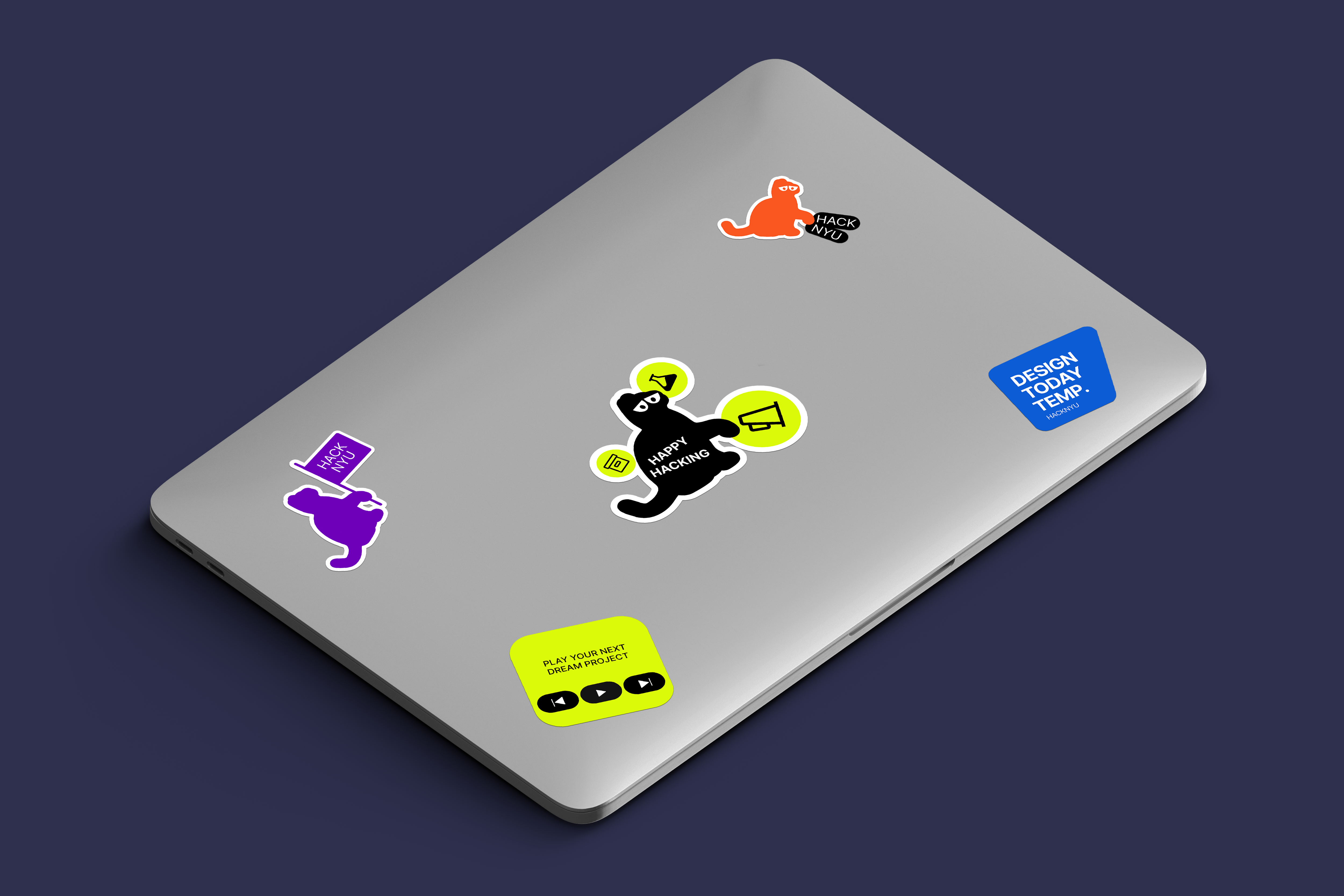
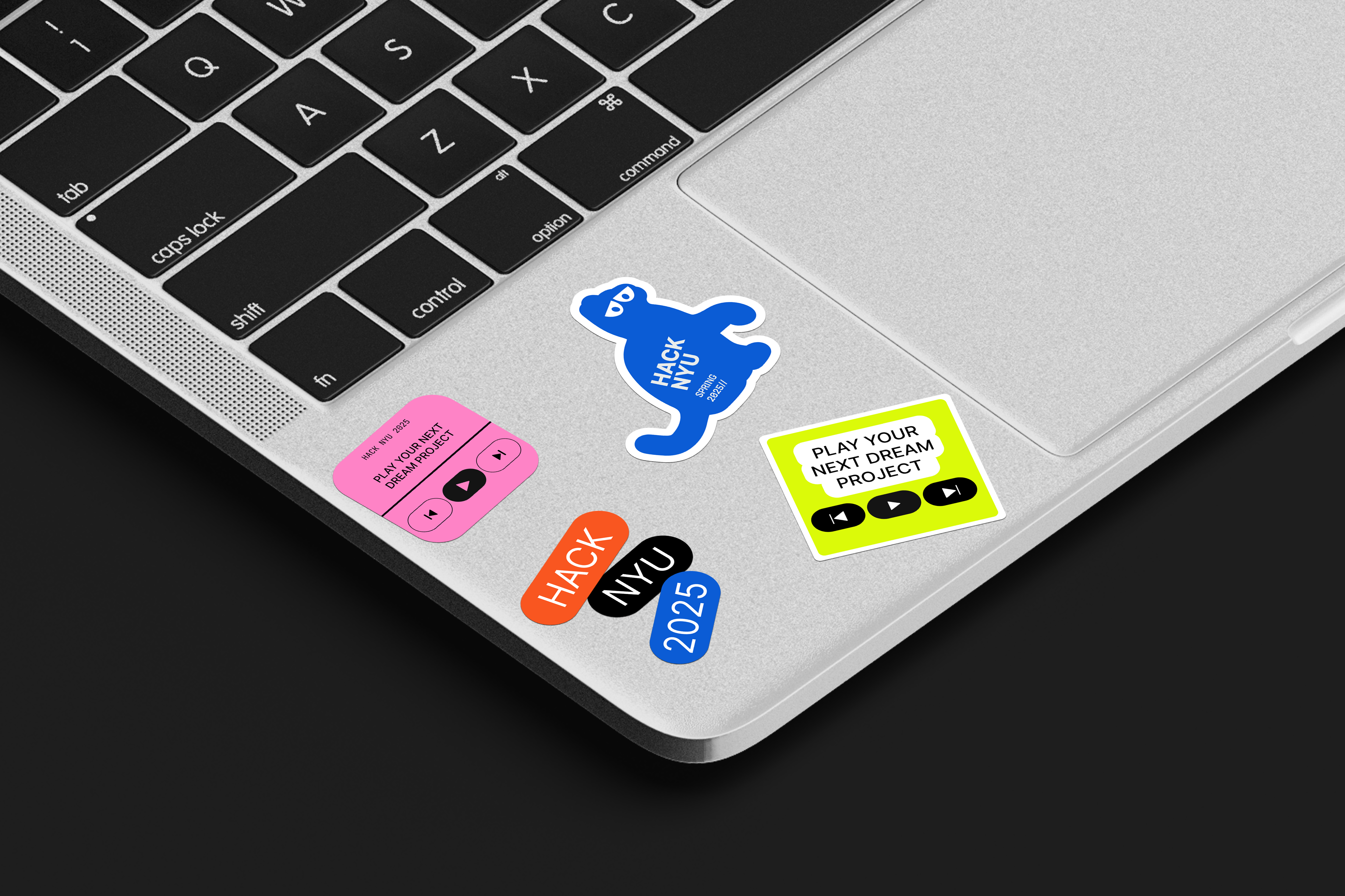
Two sticker sets, distinct in style, cohesive in system.
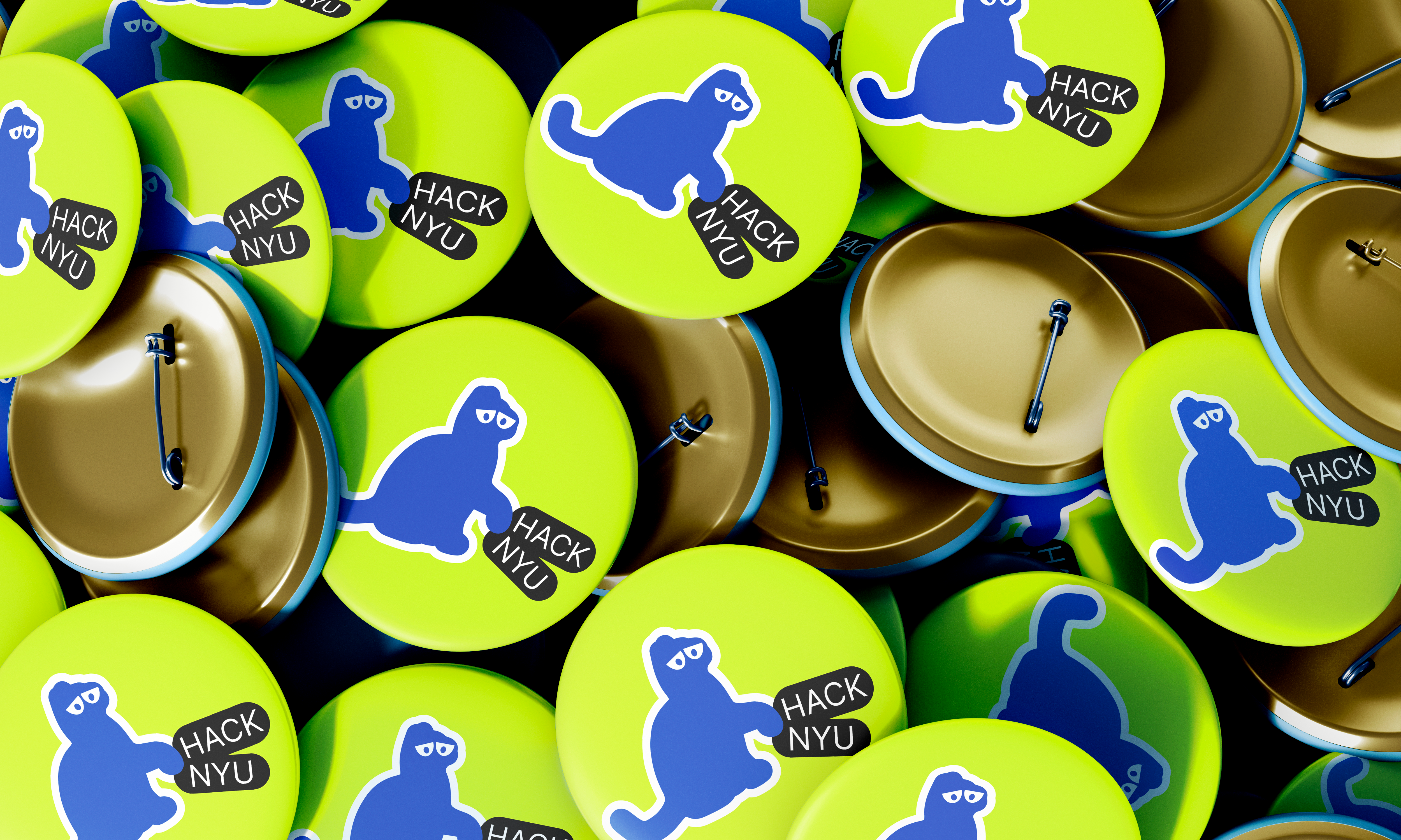
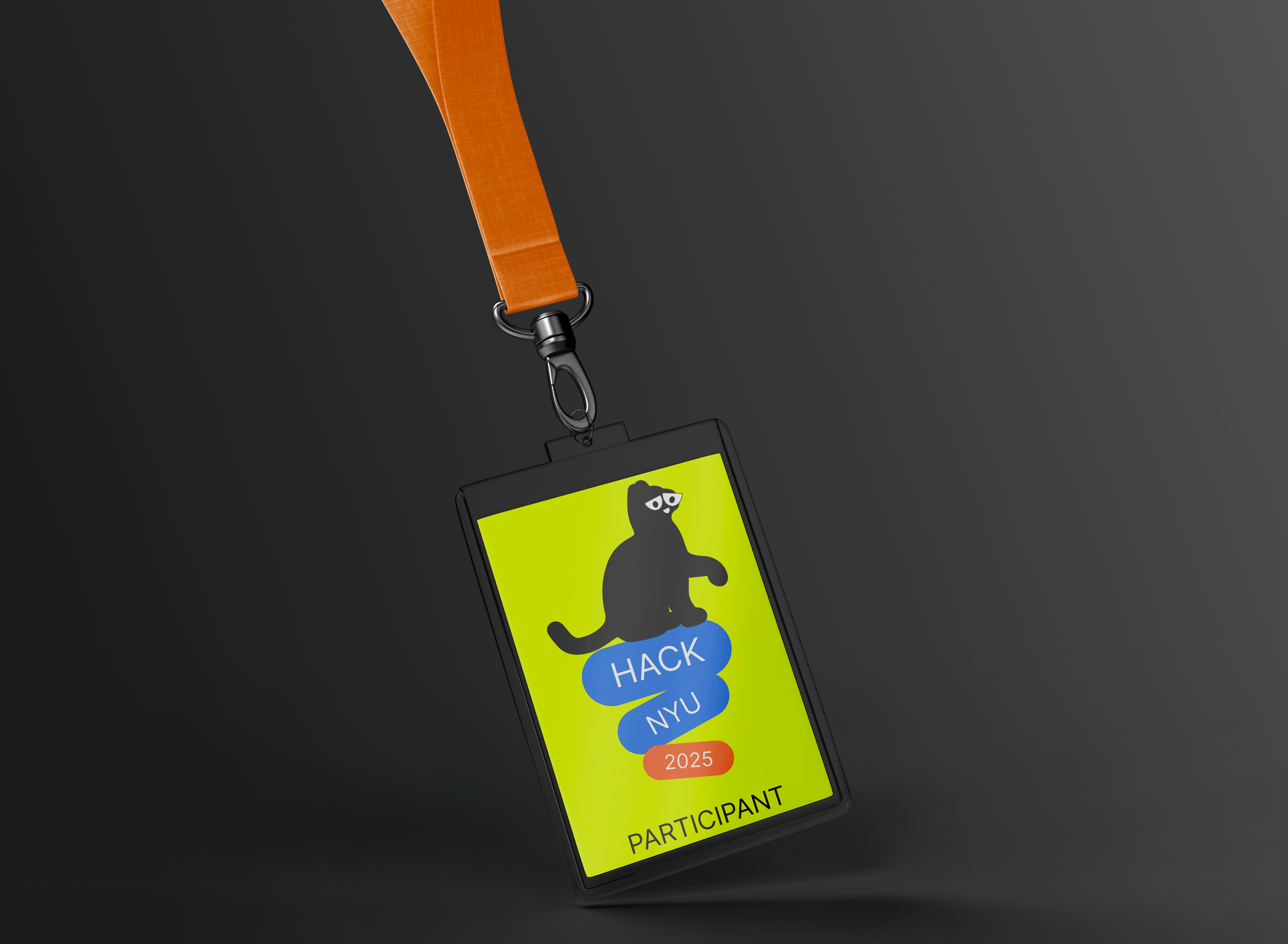
Badge and ID card, worn for all 48 hours of the event.
Every platform. One visual language.
The social campaign ran across Instagram and LinkedIn, from pre-event registration drives through live event coverage to post-event highlights. Same color logic, same grid, every platform and every post.
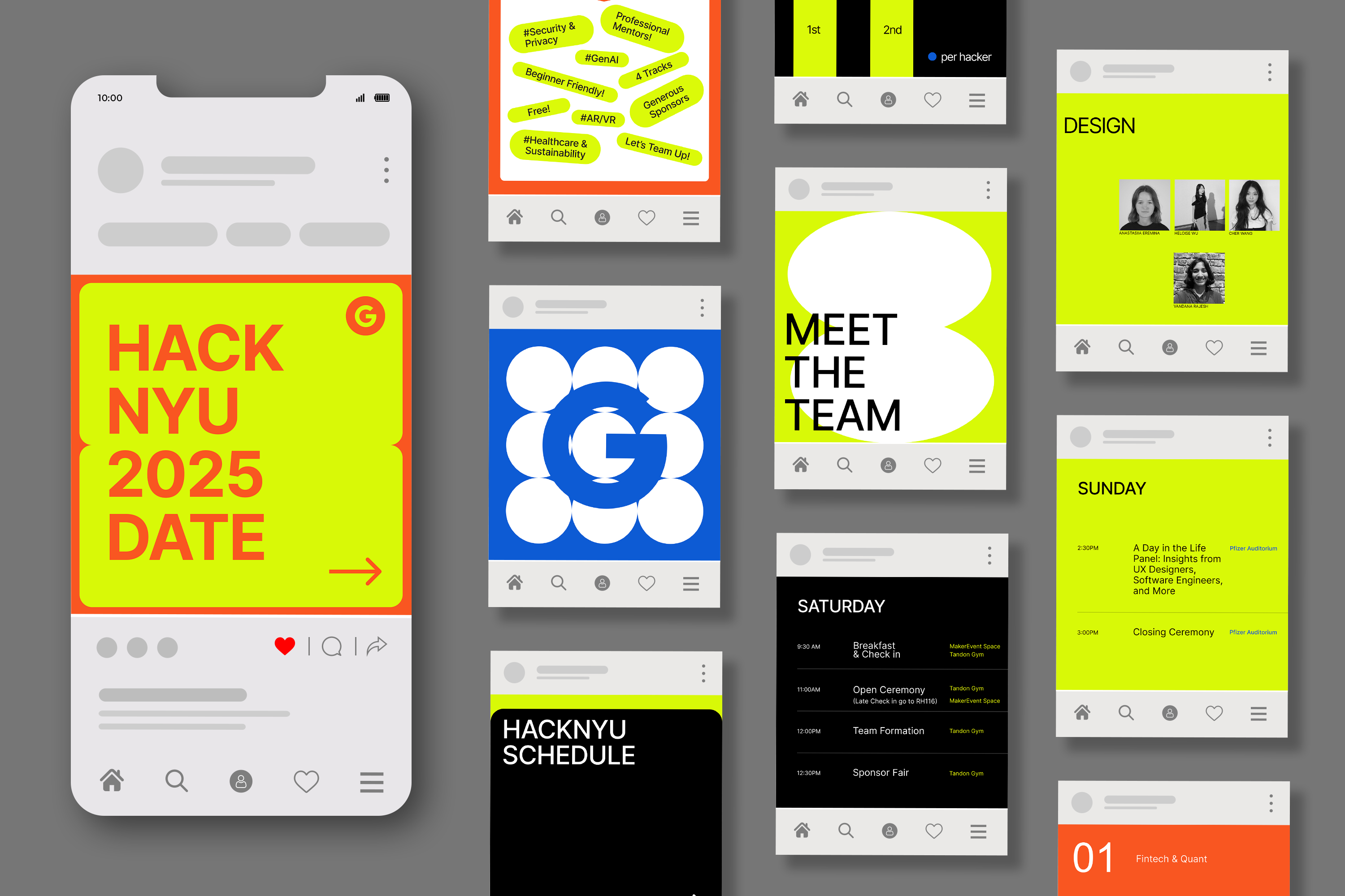
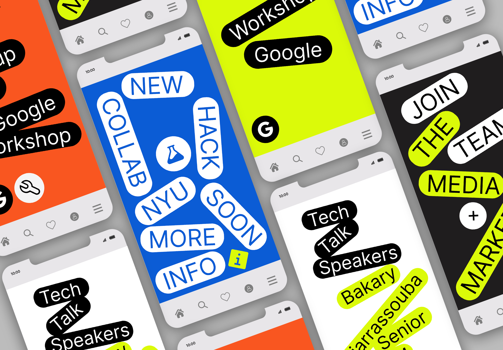
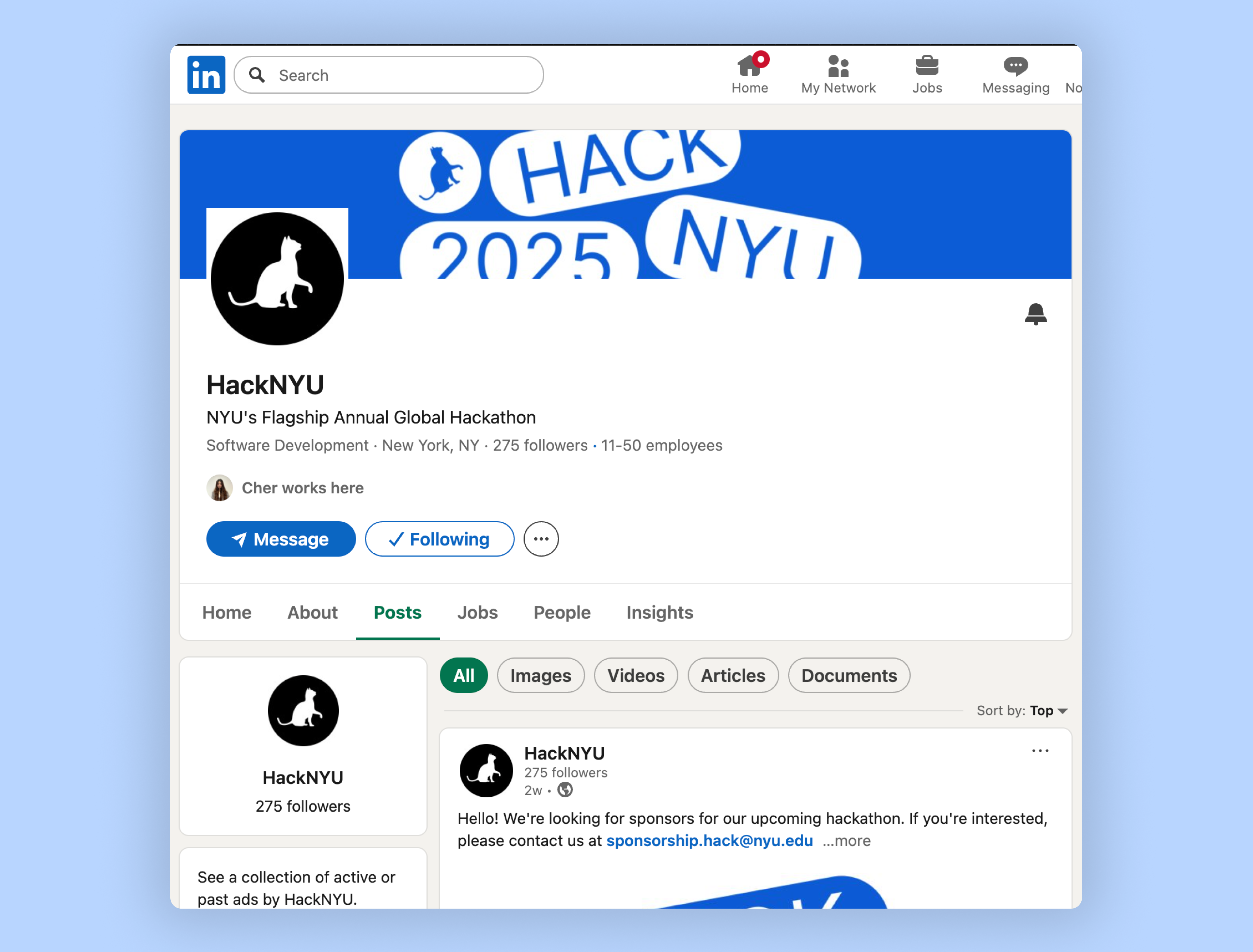
Instagram posts, story template, and LinkedIn cover, same color logic, same type hierarchy.
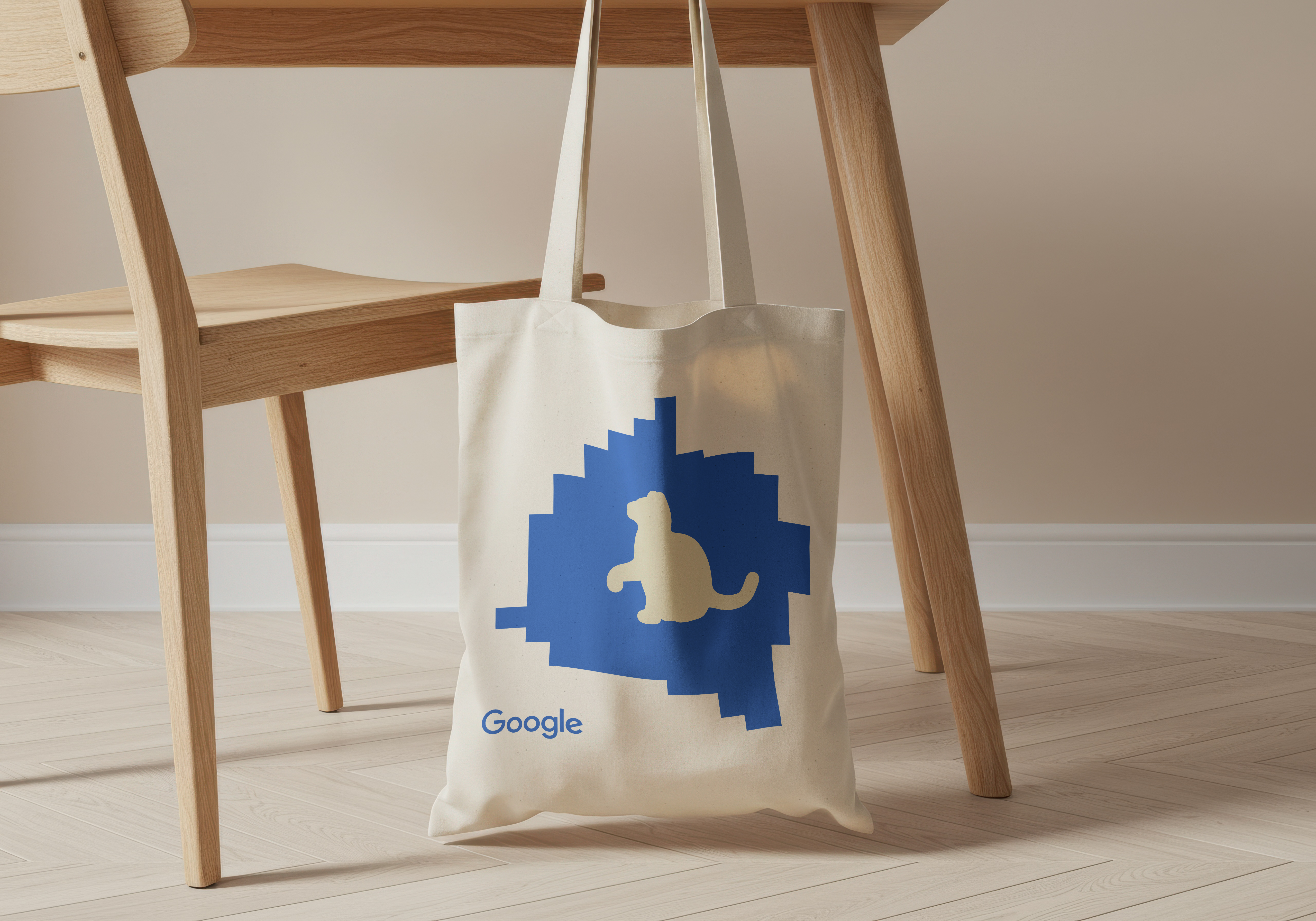
Tote bag, at scale: every tote on the subway is a brand impression.
Wayfinding at venue scale.
A hackathon venue is a temporary city, with hundreds of people navigating under time pressure. The signage system extended the brand into comprehensive wayfinding: directional, informational, atmospheric. The brand holds at six feet tall and twenty feet away.
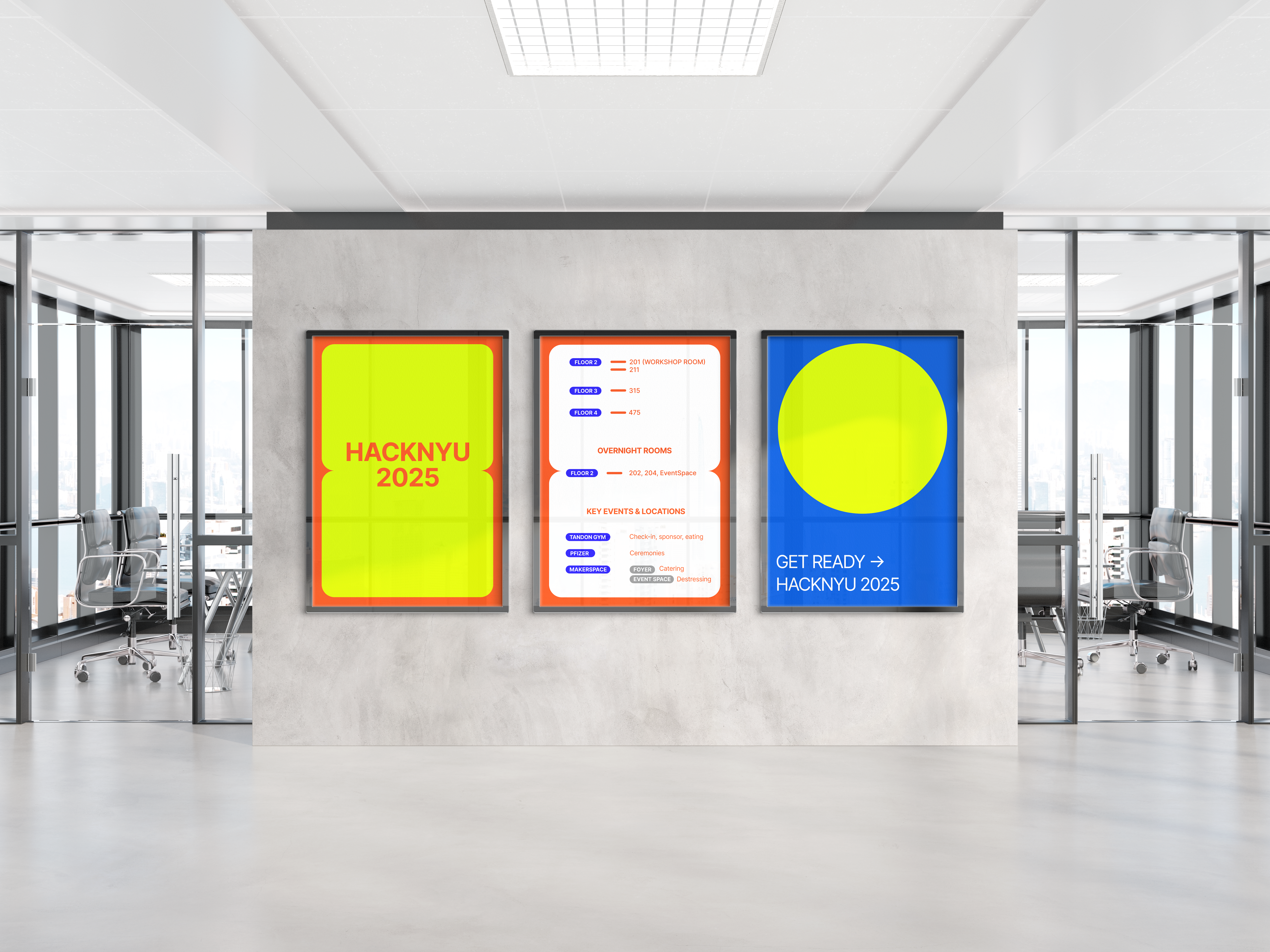
Venue signage: wayfinding, informational graphics, and atmospheric brand moments.
What branding at scale teaches you.
A brand system is only as strong as its worst application. The hoodie is easy. The ID card under fluorescent lighting at 2am with 600 people in the space is the real test. Designing for the event, not the presentation deck, changes every decision.
Fifty sponsors in an event identity is a real constraint, not a footnote. Every logo placement, every background color, every lockup decision was tested against the fact that sponsor logos don't care about your brand guidelines.