How I designed AI-powered manufacturer discovery from zero — pairing a dual-input search interface with a scalable design system to cut production time by 40% and drive 350+ followers from launch day.
Fashion entrepreneurs searching for manufacturing partners navigate a landscape that hasn't changed in decades. Alibaba listings with no quality signals. Reddit threads of anecdotes. Spreadsheets traded in private Slack groups. Every workaround reveals the same gap: there is no platform built for the way small founders actually discover suppliers.
Pomu set out to close that gap — an AI-assisted B2B marketplace where founders could describe what they wanted to make, upload a reference image, and receive matched manufacturers ranked by fit, capacity, and verified credentials.
As the founding product designer, I owned the full design surface with no existing patterns to inherit.
My CS background meant I could participate in technical decisions, not just receive them.
Before drawing a single screen, I ran discovery interviews with early-stage fashion founders across New York and Los Angeles. Sessions were semi-structured around three prompts: describe your current process for finding suppliers, walk me through your last bad experience, and what would make you trust a platform recommendation.
Affinity mapping across 12 sessions produced four clusters that shaped every subsequent design decision.
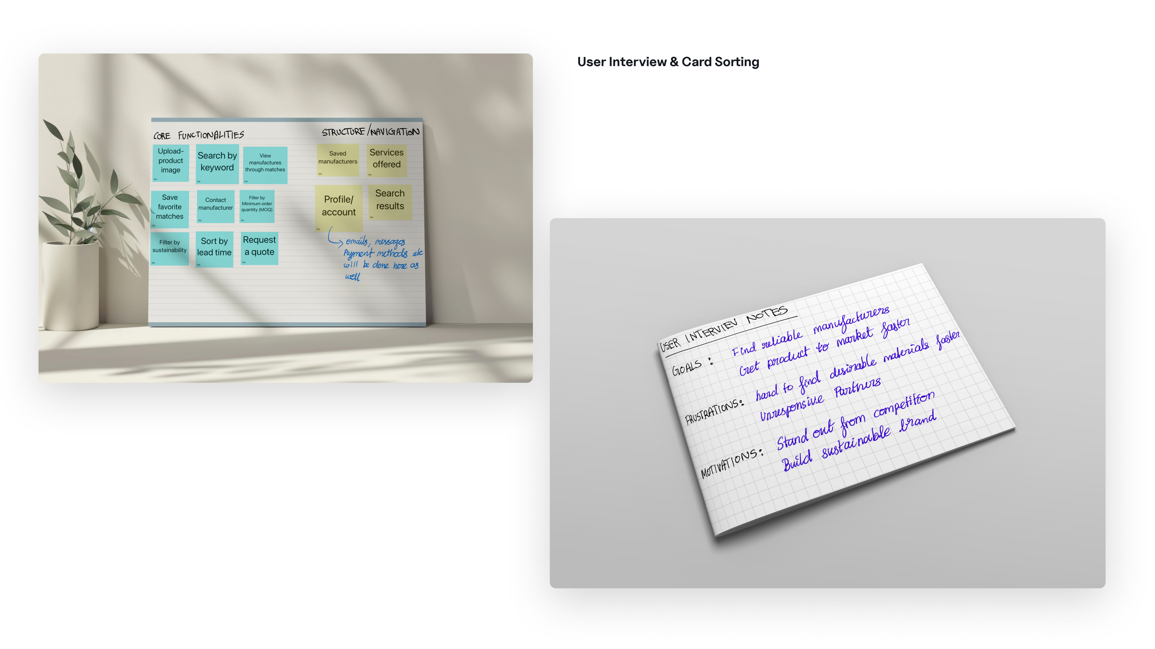
Fig. 2 · Affinity mapping across 12 discovery interviews. Four friction clusters emerged and guided the entire design strategy.
Fig. 3 · Research synthesis visualization — friction clusters extracted from 12 founder interviews. Every product decision mapped back to at least one of these four clusters.
Early assumptions pointed toward a search problem. What the research surfaced was a translation problem. Founders had clear creative vision and zero manufacturing vocabulary. Existing platforms demanded expertise they didn't have before they could even begin searching.
This reframe drove the core product hypothesis: what if the search experience was designed around the user's mental model, not the supplier's catalogue structure? A founder should be able to upload a reference image of a coat they admire, type "I want something like this in organic cotton, under 200 units," and get back ranked matches without knowing a single technical term.
Accept natural-language descriptions and visual references as first-class inputs. Translate them into structured queries so founders never have to learn the system's vocabulary.
Every supplier card had to show verifiable signals — certifications, MOQ ranges, turnaround windows, capability tags. Confidence scores on AI matches had to be visible and explainable, not hidden.
Before any screen-level work, I mapped the full user journey end to end. The key structural challenge was progressive disclosure: show enough to build confidence at each step without overwhelming a founder who is encountering manufacturing discovery for the first time.
Fig. 4 · Information architecture — full product flow from onboarding to supplier connection. Progressive disclosure structured each stage to reduce cognitive load.
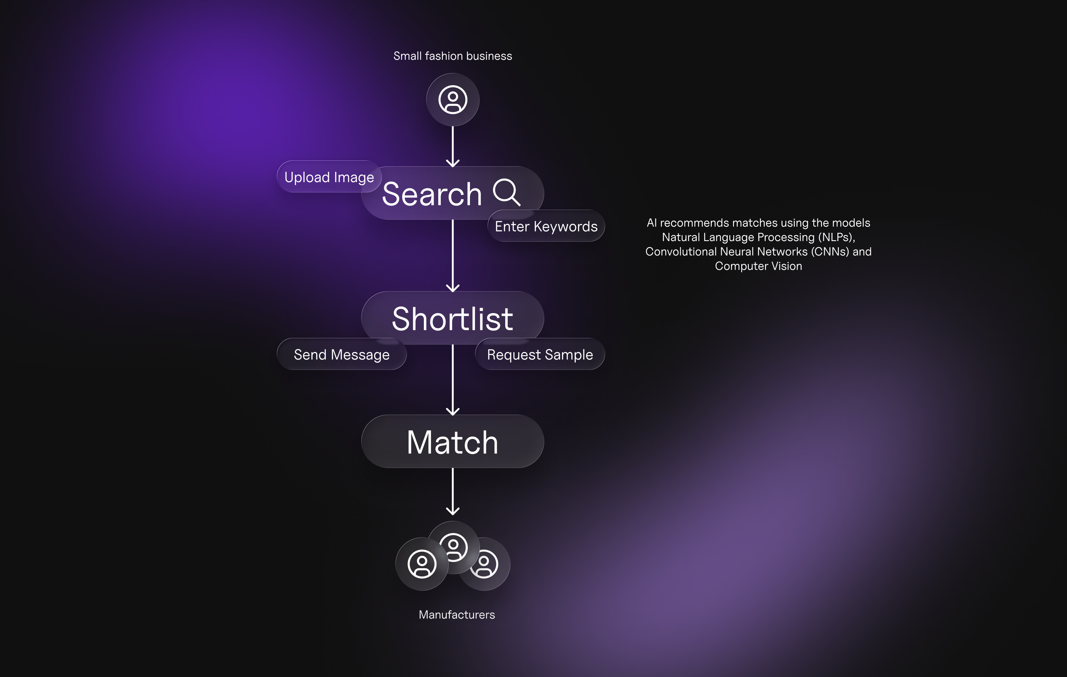
Fig. 5 · Figma IA diagram — guided search-to-match journey with decision nodes and edge cases mapped.
The most complex design challenge was the search interface itself. Founders needed two simultaneous inputs — a visual reference and a natural-language description — processed together by the backend AI. The interface had to feel like one coherent action, not two separate inputs bolted together.
Three core decisions shaped the final search pattern:
The CNN extracts garment attributes from uploaded images. The NLP layer processes text descriptions. Together they generate a ranked supplier list. My design problem: how do you show a user that the AI understood them, without exposing technical internals?
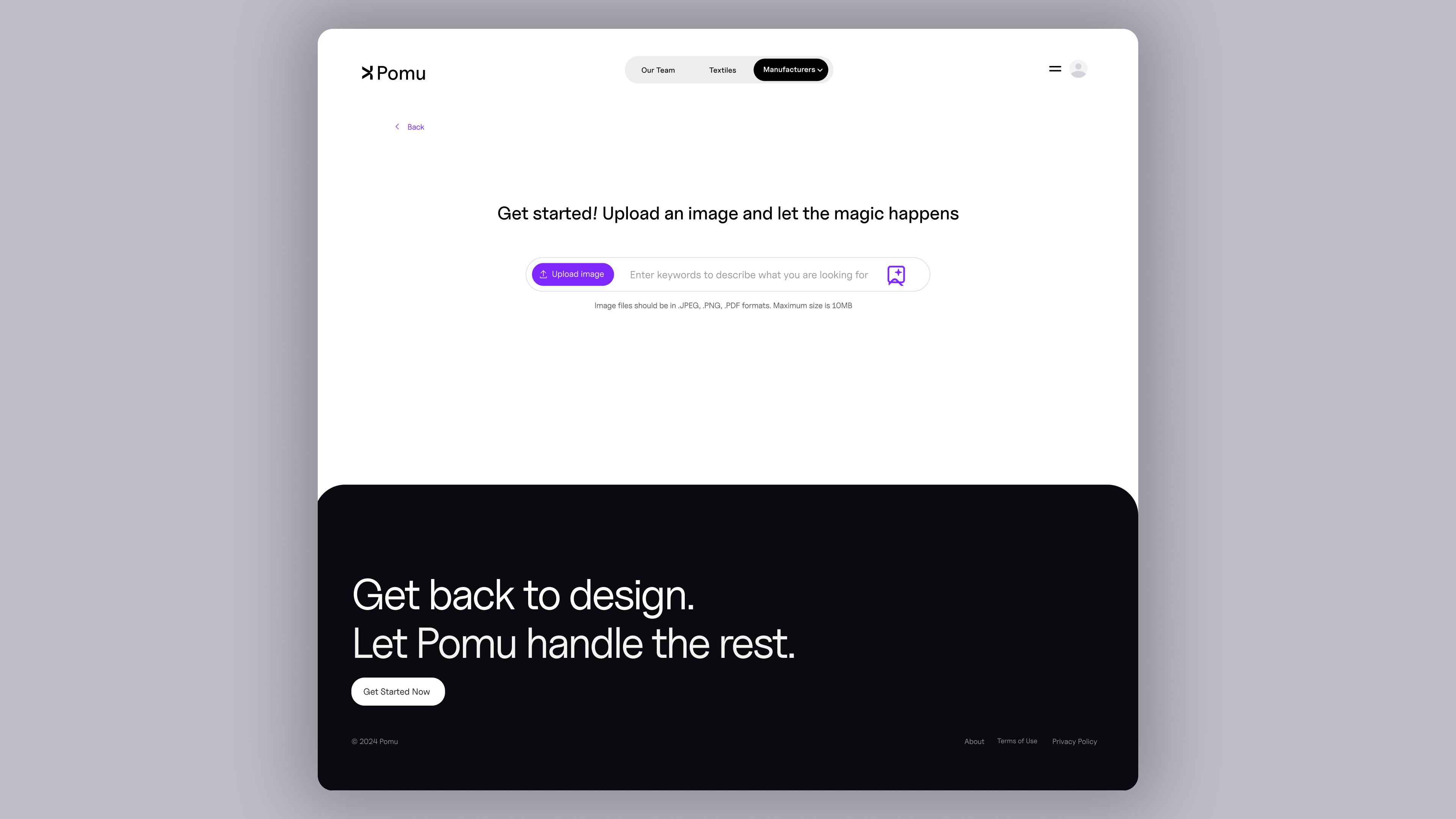

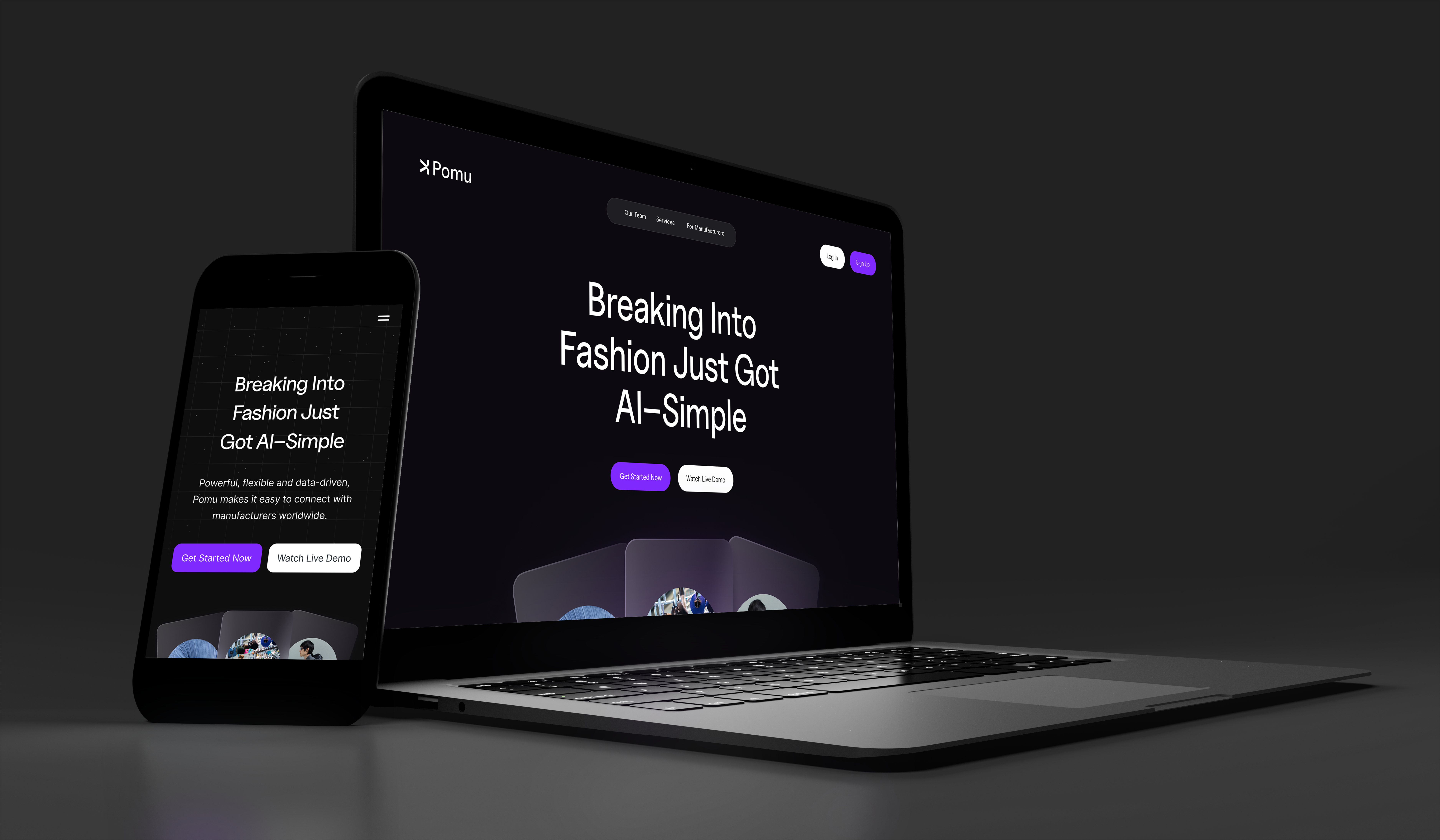
Fig. 6–7 · Search interface (left) and results page (right). Co-located inputs, confidence scoring, and transparent match reasoning across both surfaces.
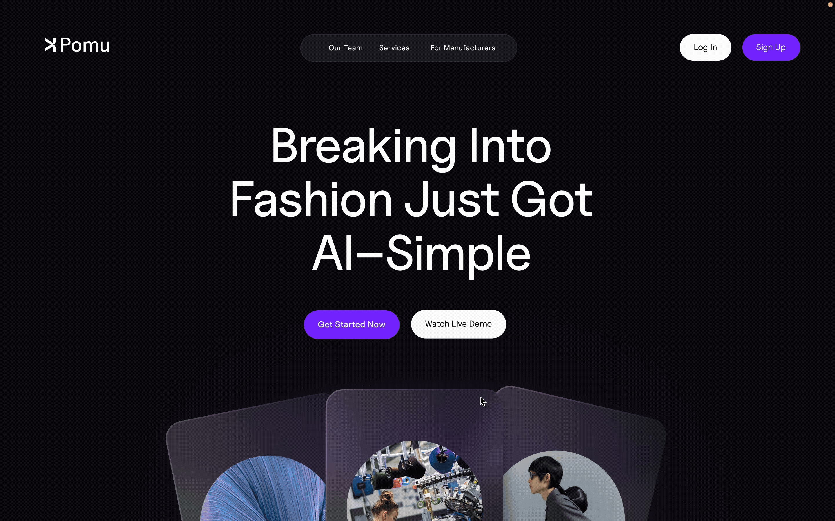
Fig. 8 · Prototype demo — onboarding intake through to ranked results page with dual-input AI search in action.
.png)
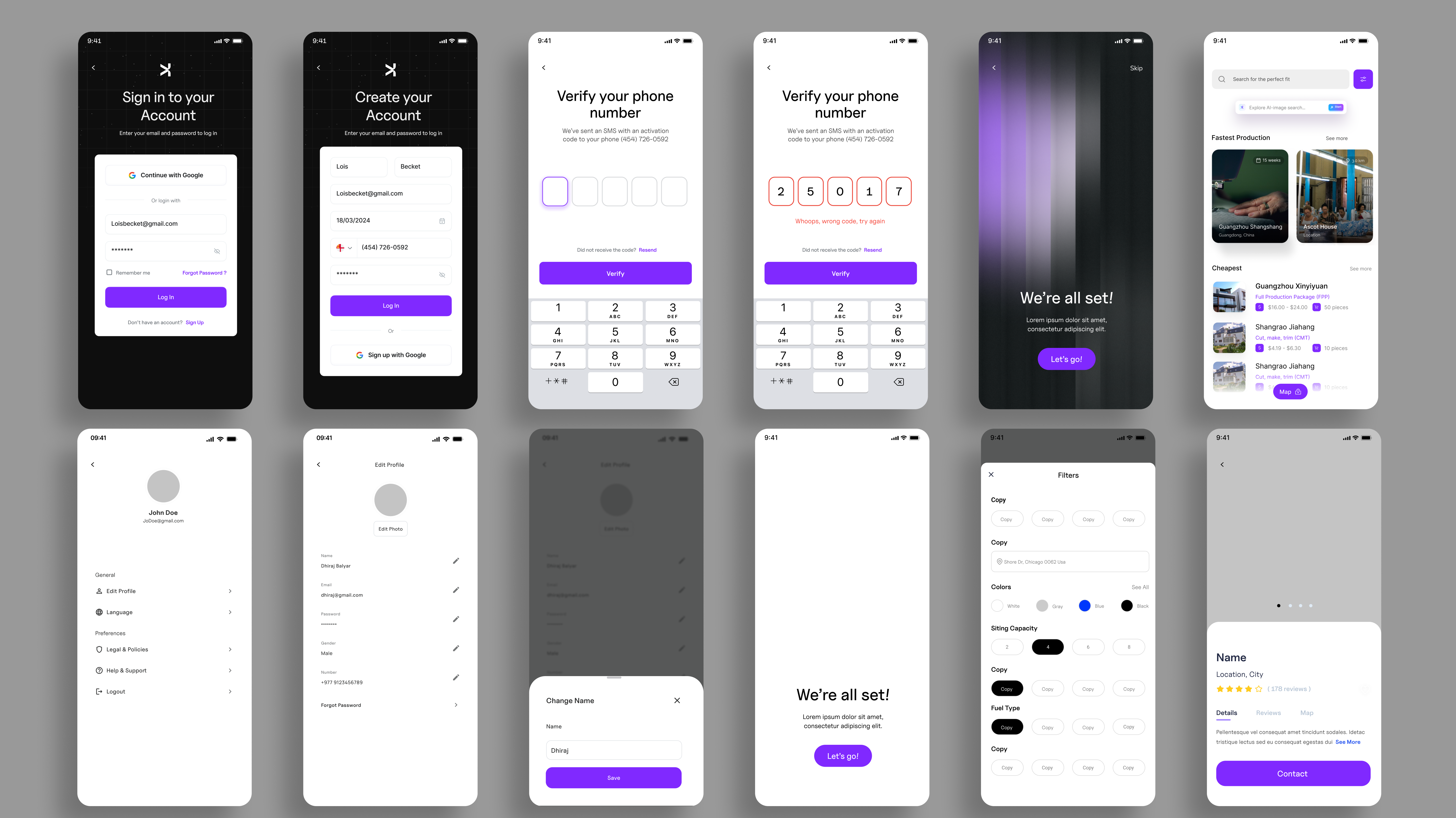
Fig. 9–10 · Mobile experience — full responsive layout across authentication, onboarding, search, and results surfaces. WCAG 2.1 AA contrast verified throughout.
Fig. 11 · AI search interaction model — how the CNN + NLP pipeline connects to the UI layer I designed. Each AI output required a corresponding UI pattern to make it legible to non-technical users.
As the sole designer working alongside three engineers, I knew that every hour spent re-explaining a component decision was an hour the product wasn't shipping. I built the design system not just as a Figma library but as a shared contract — a single source of truth that engineers could pull from directly.
The output was a 40% reduction in time to ship new product surfaces. That number comes from comparing pre-system and post-system velocity tracked in our sprint reviews.
Fig. 12 · Design system architecture — three-layer model from tokens through composite patterns. Each layer reducedengineering interpretation time by giving explicit specifications.
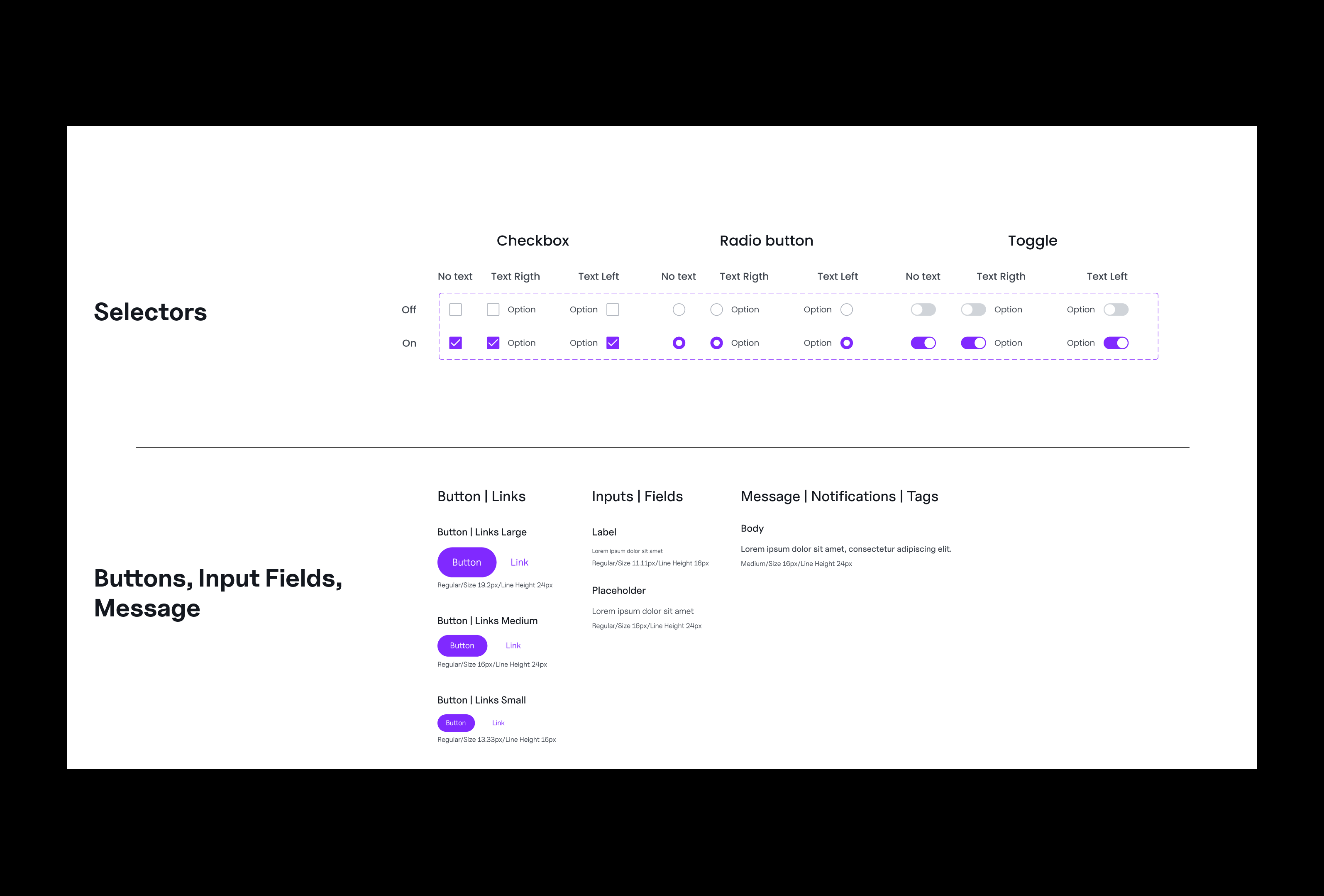
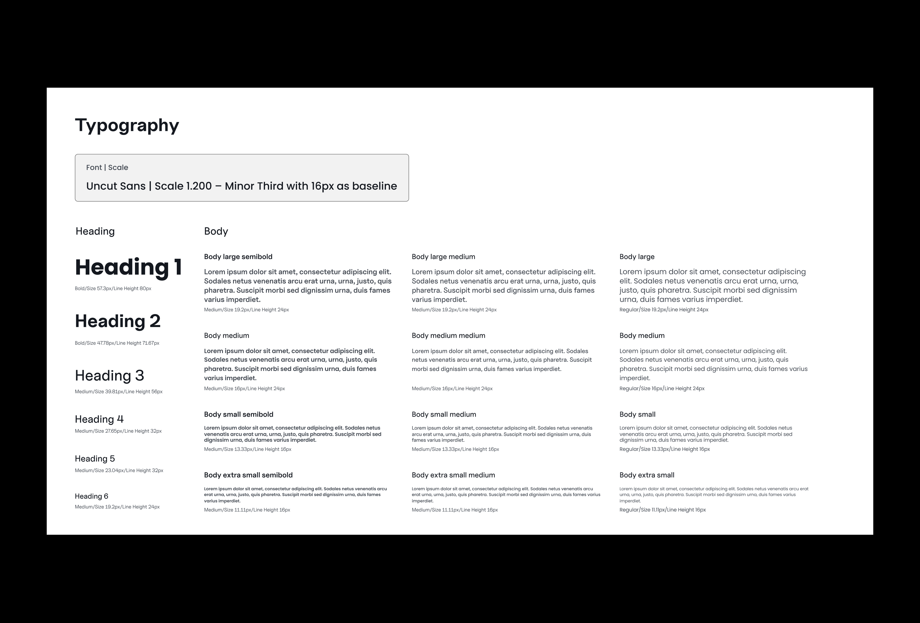
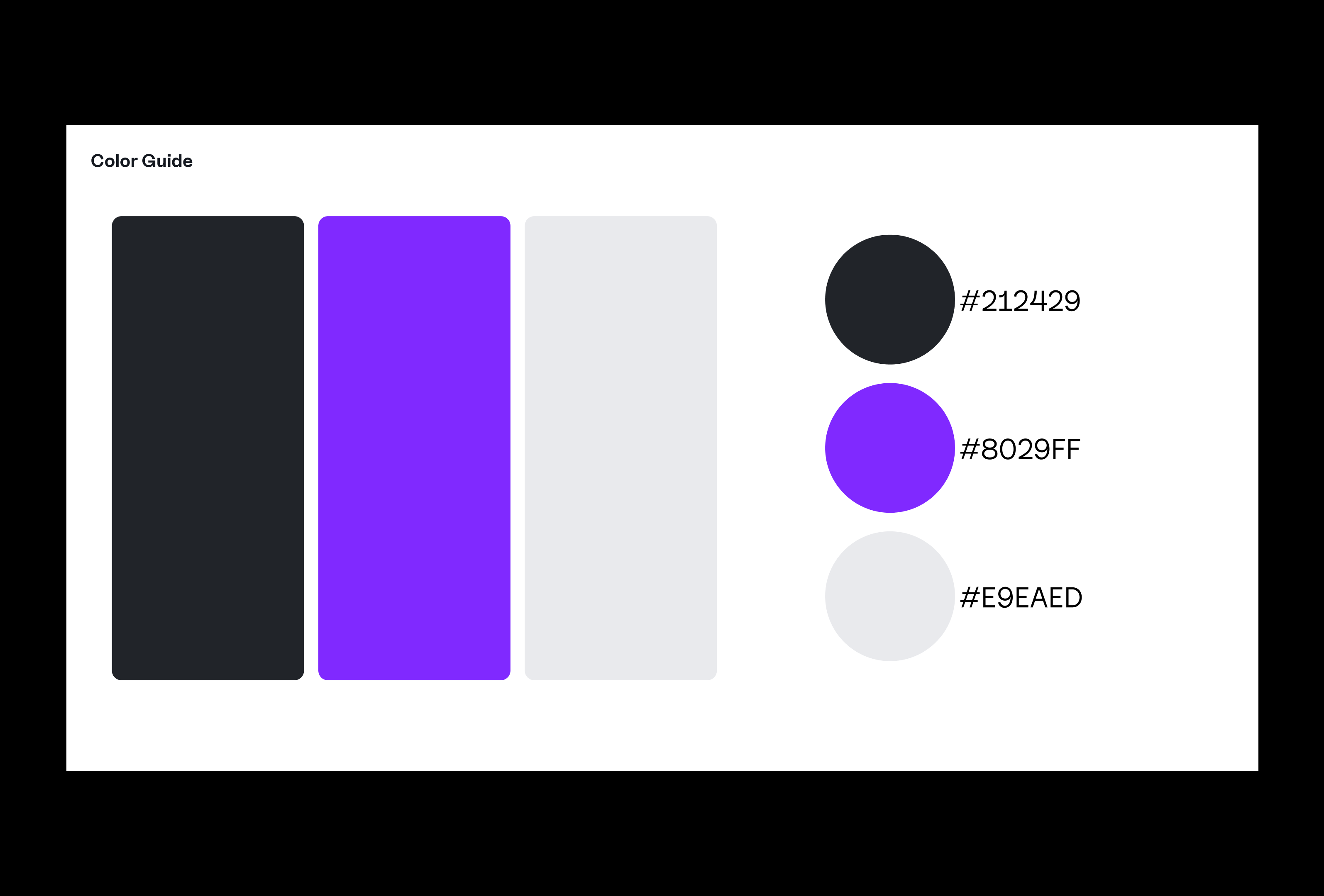
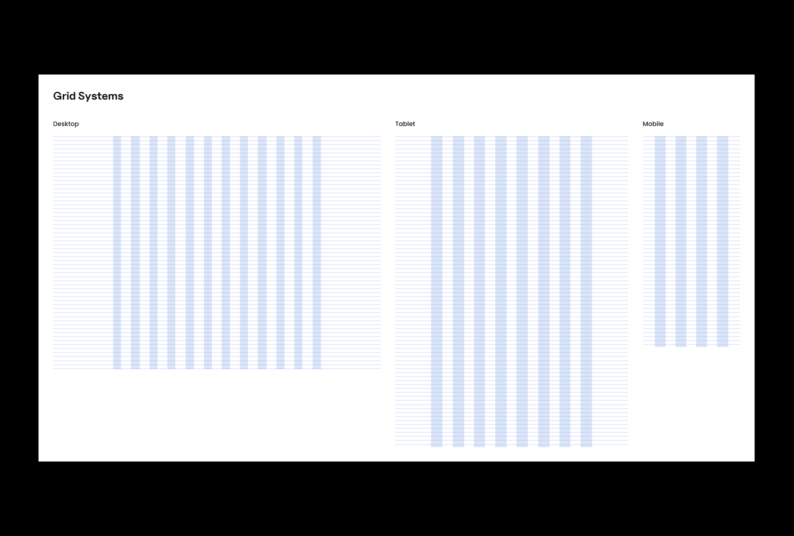
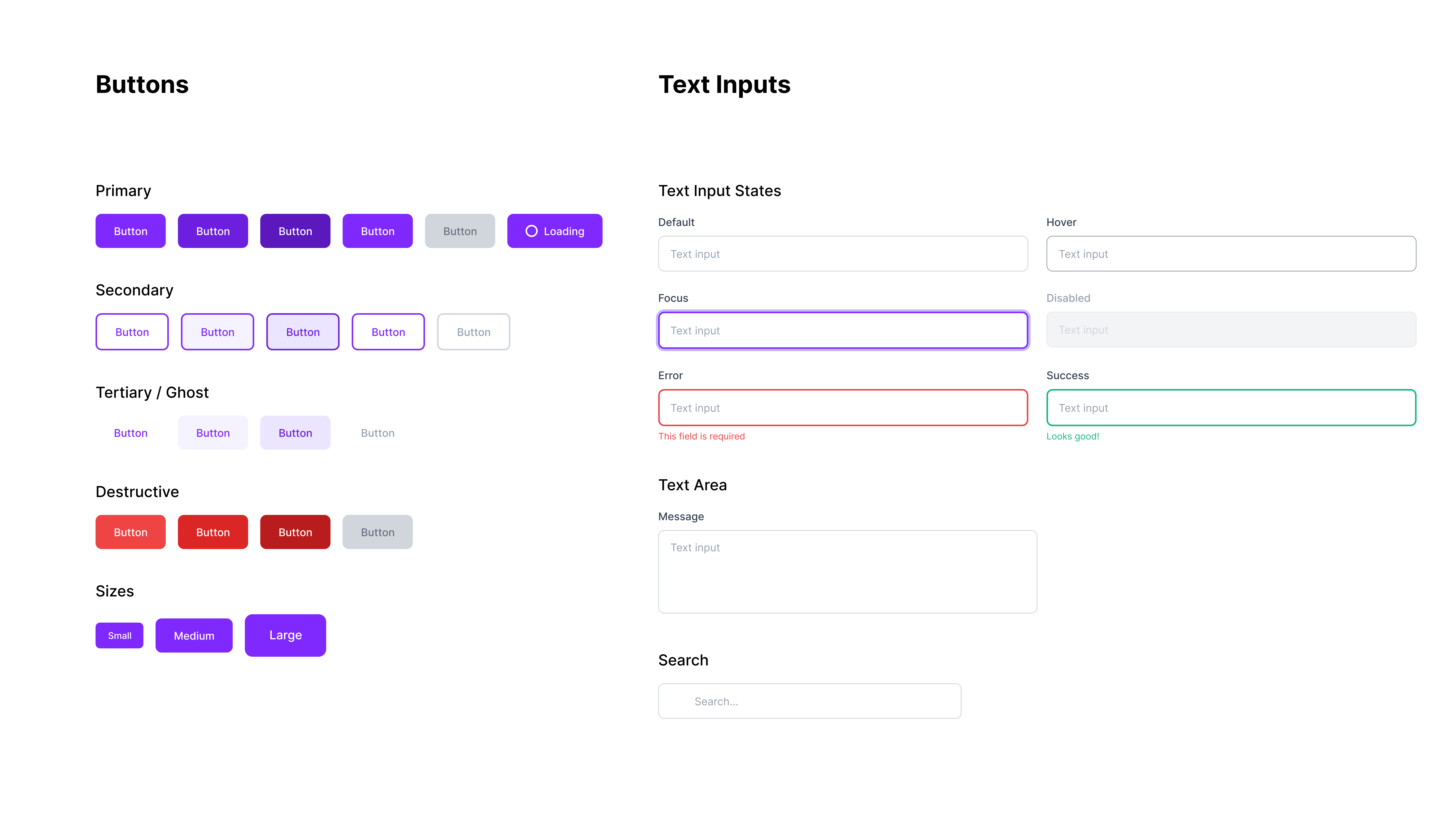
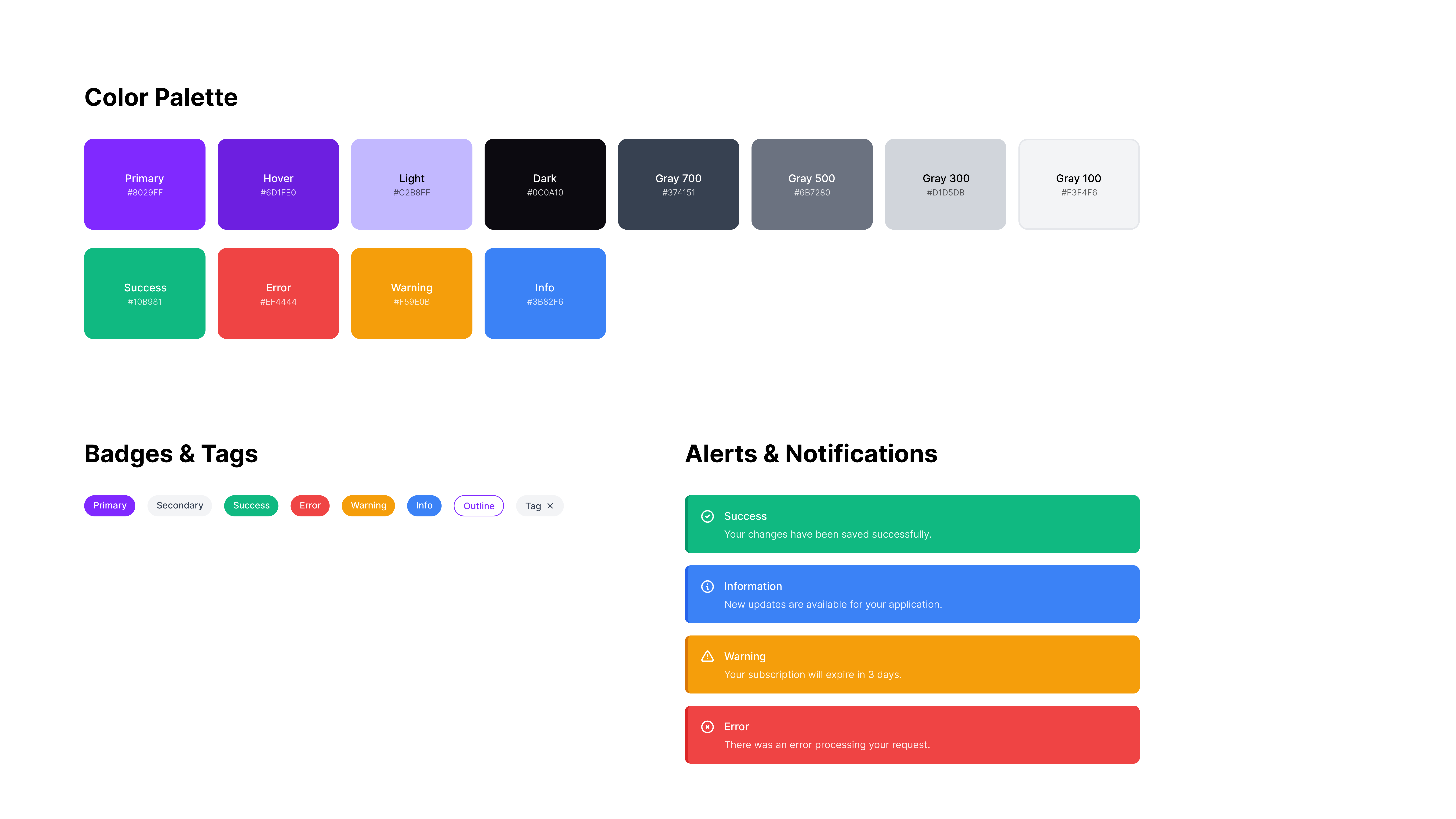
Fig. 13 · Design system — components, typography scale, color tokens, grid, and assembled patterns.
Pomu needed to appeal simultaneously to independent fashion founders and to manufacturing operators. Neither audience shared a visual language or trust vocabulary. The brand had to feel modern and credible to a Brooklyn streetwear founder and professional and reliable to a manufacturing director in Hanoi.
Every decision was justified against both audiences: the name, the mark, the palette, the motion language. Pomu — a coined word combining "polymer" and "mu" (the Japanese character for nothingness, evoking clean possibility) — gave us a blank slate to build meaning onto rather than inheriting industry baggage.
Fig. 14 · Brand identity system — logomark, wordmark, and visual guidelines. Designed to scale across both founder-facing and supplier-facing surfaces.
To drive early awareness before full platform launch, I designed a LinkedIn content system that allowed the team to publish consistently without individual design bottlenecks. The template system covered announcement posts, founder spotlight formats, and product update cards — all derivable from the brand token set without opening Figma.
Result: 350+ LinkedIn followers from zero within three months of launch. The template system removed one production bottleneck and let the founding team ship content at startup velocity.

Fig. 15–16 · LinkedIn campaign templates — primary and secondary content layouts built from the brand token set. Non-designers on the team could publish on-brand content without design intervention.
Designing Pomu taught me that zero-to-one work is fundamentally about prioritization under uncertainty. There are no existing patterns to validate against. Every decision is a bet, and the quality of your research determines how well-placed those bets are.
Working inside an AI pipeline changed how I think about user mental models. The system's capabilities were fixed; the design was the translation layer. Learning to make AI outputs feel comprehensible, not magical, is now a core part of how I approach any ML-adjacent product surface.
The 40% production time reduction from the design system confirmed something I believed but hadn't yet proven at scale: the best design system is one that encodes decisions, not just assets. Every token name, every spacing rule, every component variant was a decision that didn't need to be re-made in a sprint.