Designing the complete visual identity for NYU's premier hackathon — 600+ participants, 15+ assets, one cohesive system.
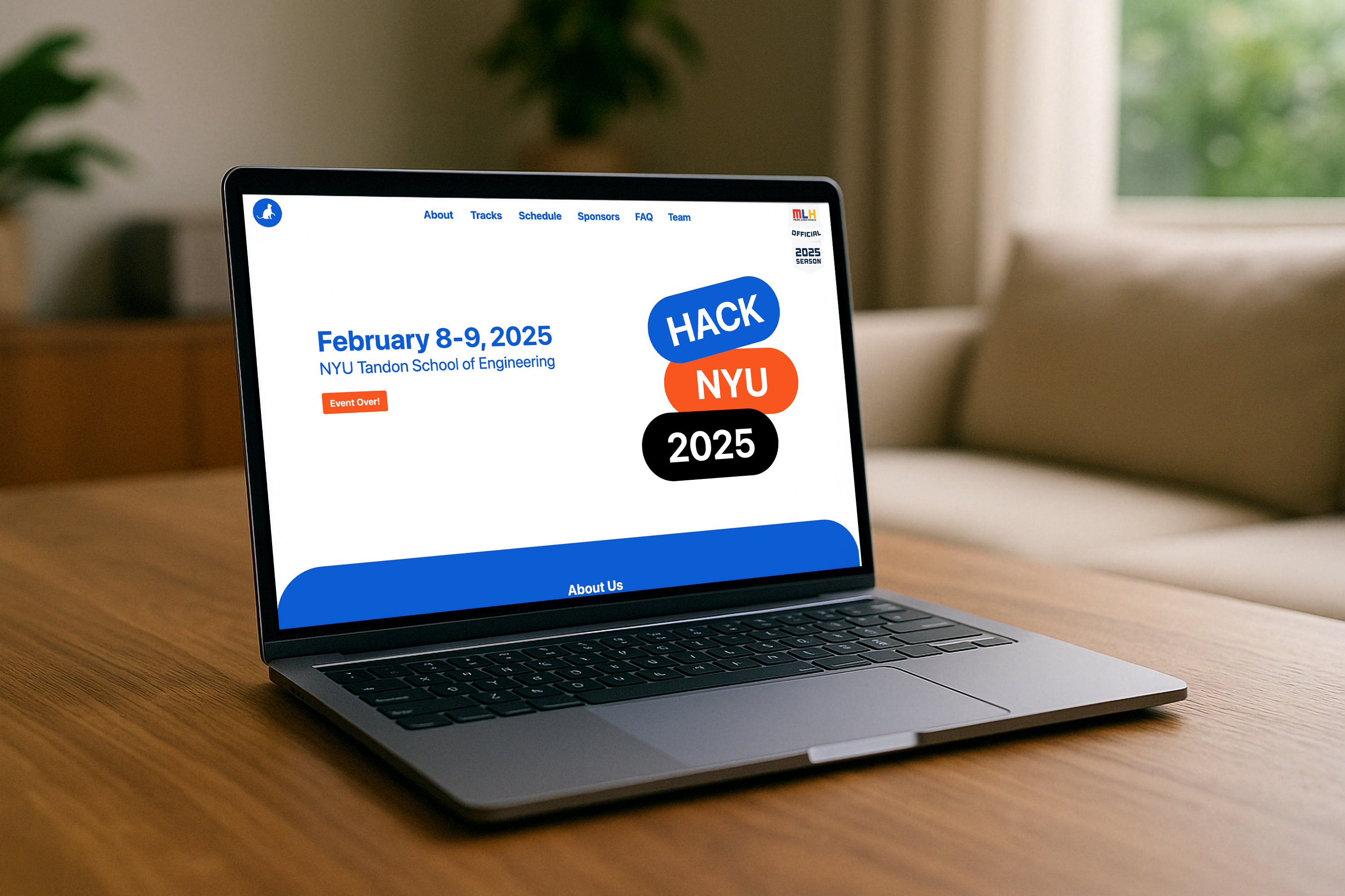
HackNYU is NYU's flagship hackathon — a 48-hour sprint where hundreds of students, engineers, and designers converge to build, compete, and collaborate. With Google among its sponsors, the event demands a visual identity that holds up under scrutiny from people who design for a living.
I owned the brand end-to-end — from the first Instagram post that drove registrations to the tote bags participants carried home. Every asset had to feel like part of the same deliberate system.
Hackathon apparel has a reputation for being generic. My goal was to create designs that felt specific to HackNYU's energy — bold enough to stand out, considered enough that people would reach for them weeks later.
The hoodie and T-shirt designs were developed across front and back, with the back treatment carrying the heavier graphic work.
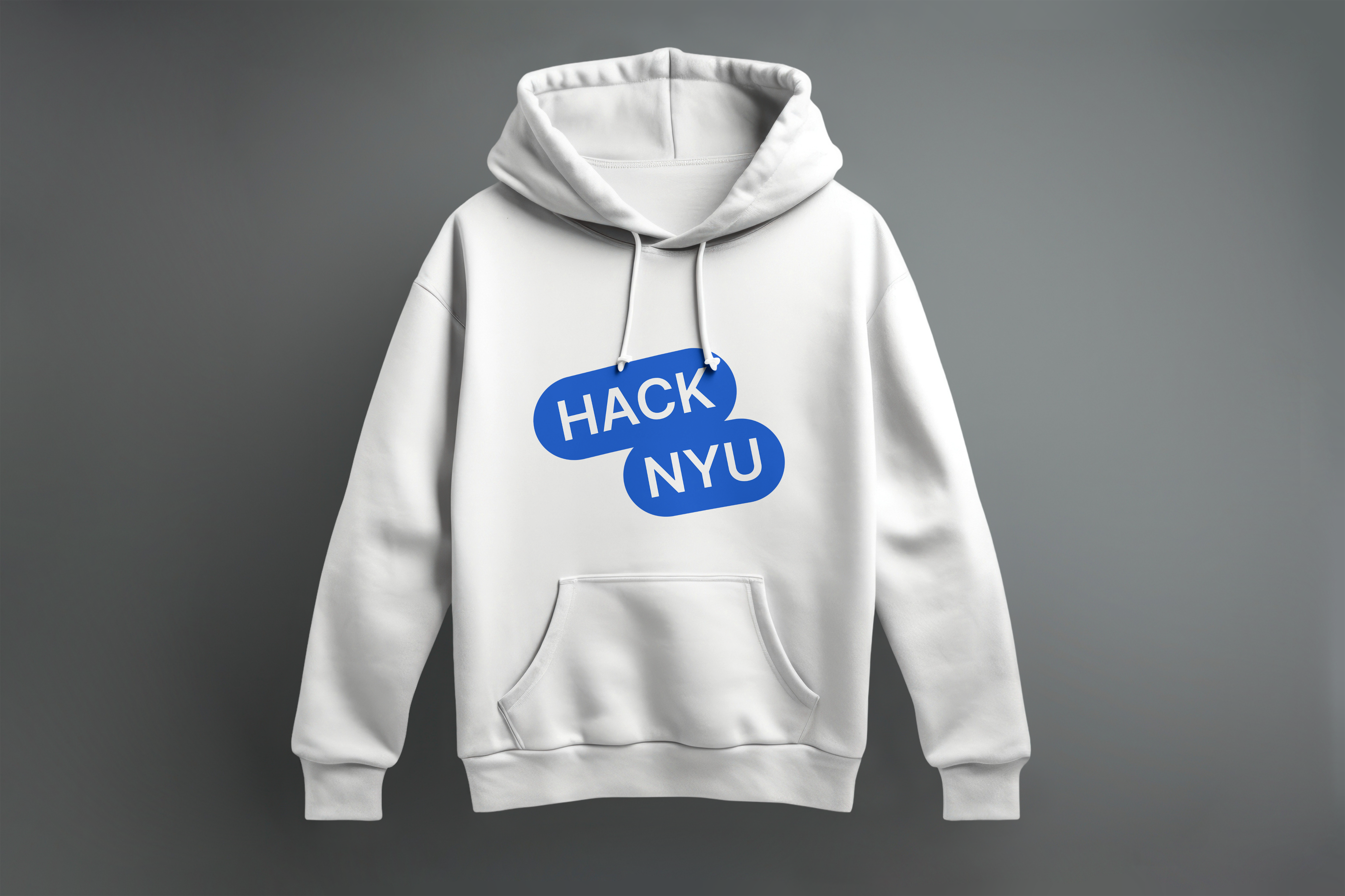
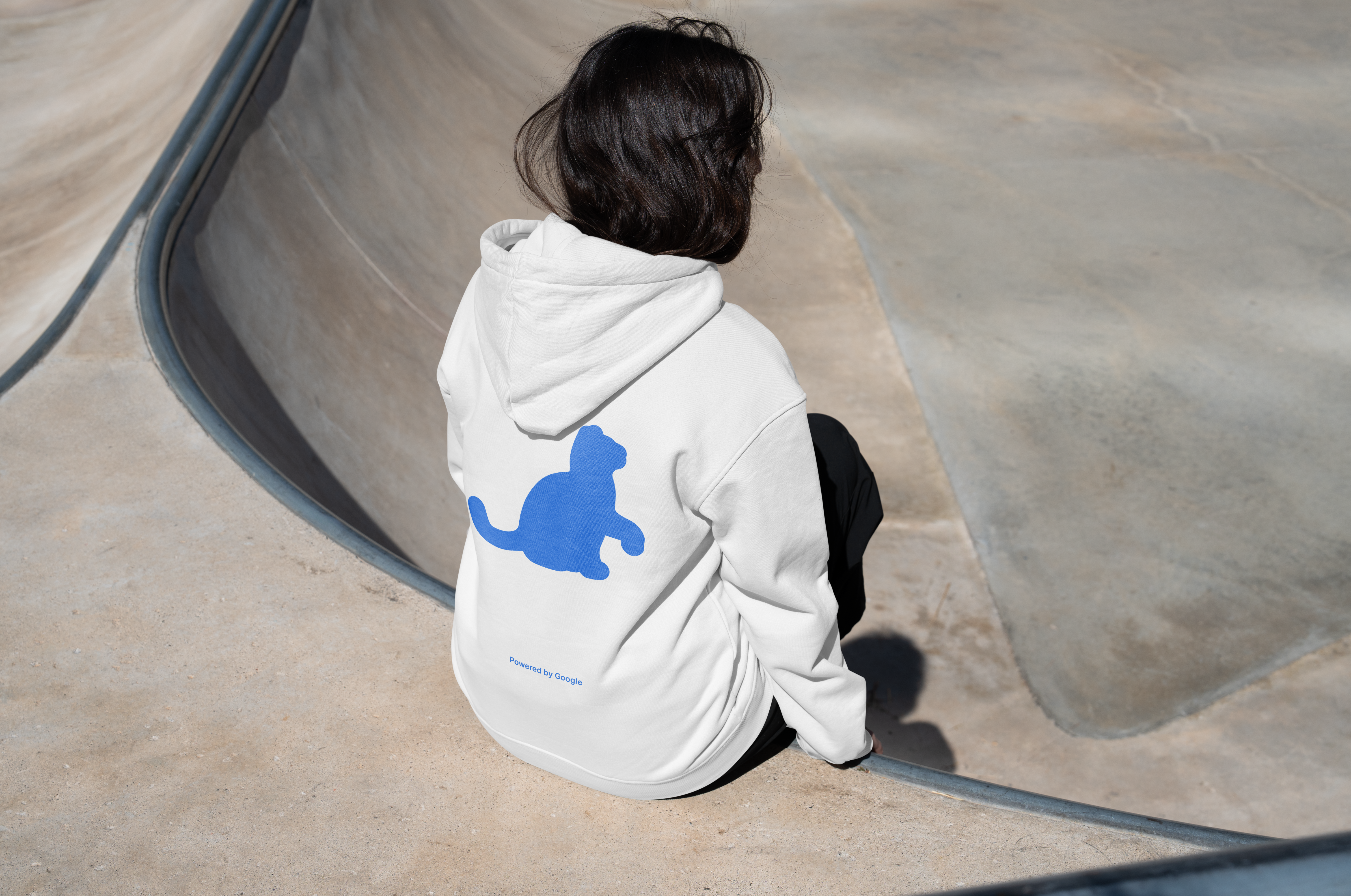
Fig. 2–3 · Hoodie — front design (left) and back design (right).

Stickers are the unofficial currency of hackathons. The sticker set needed to be genuinely desirable — participants trade them, stick them on laptops, and carry them as the most portable record of where they've been.
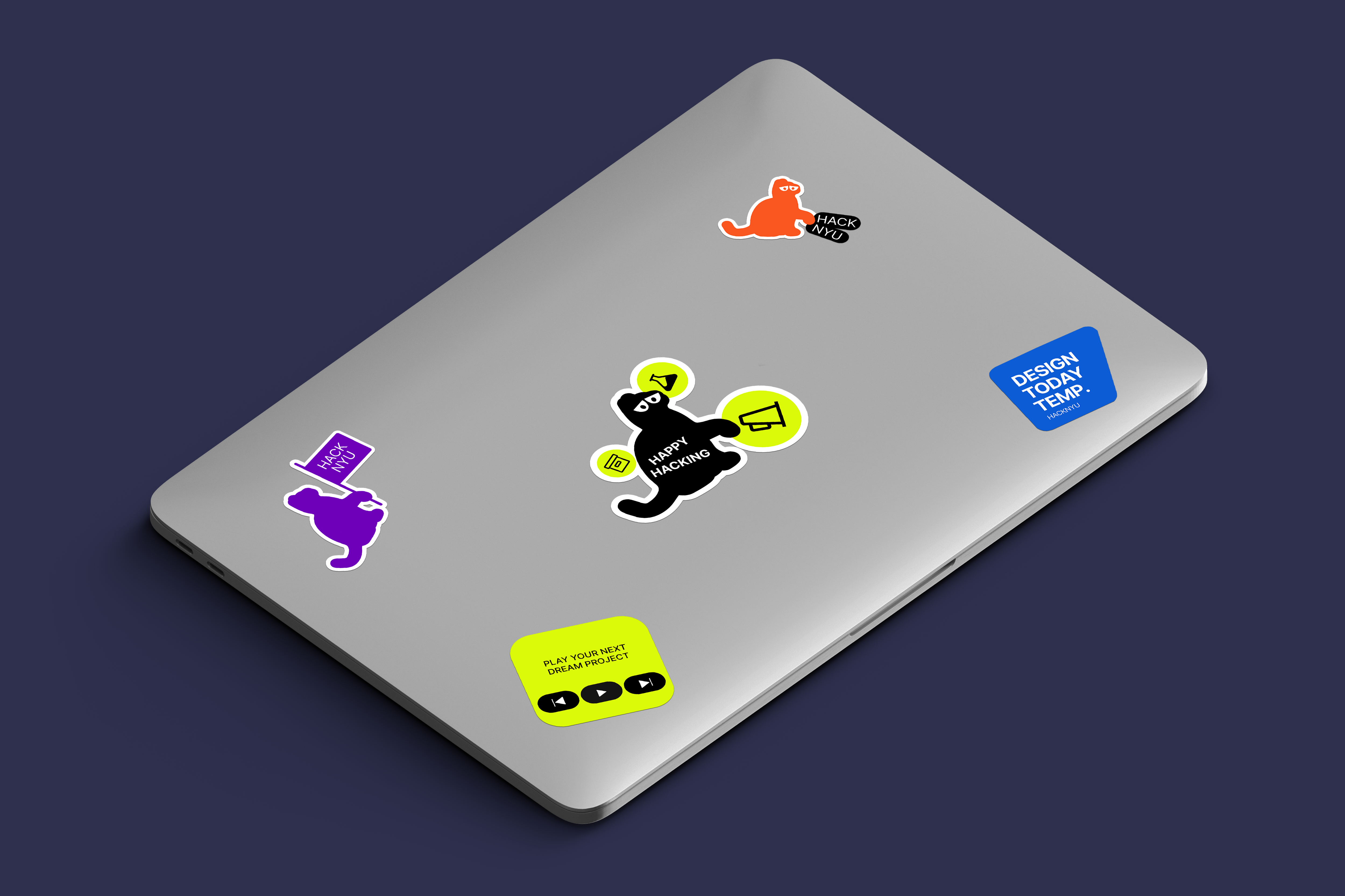
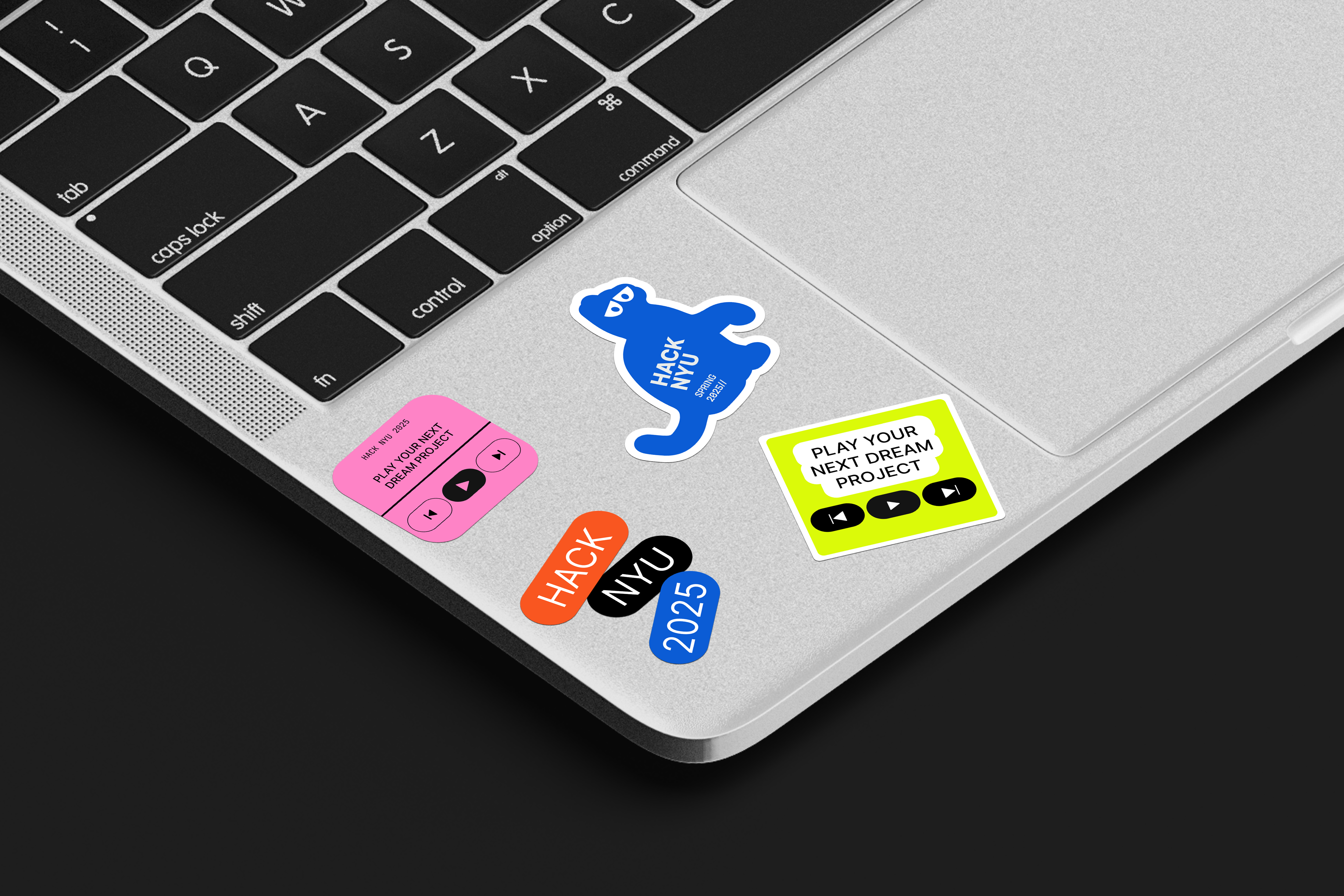
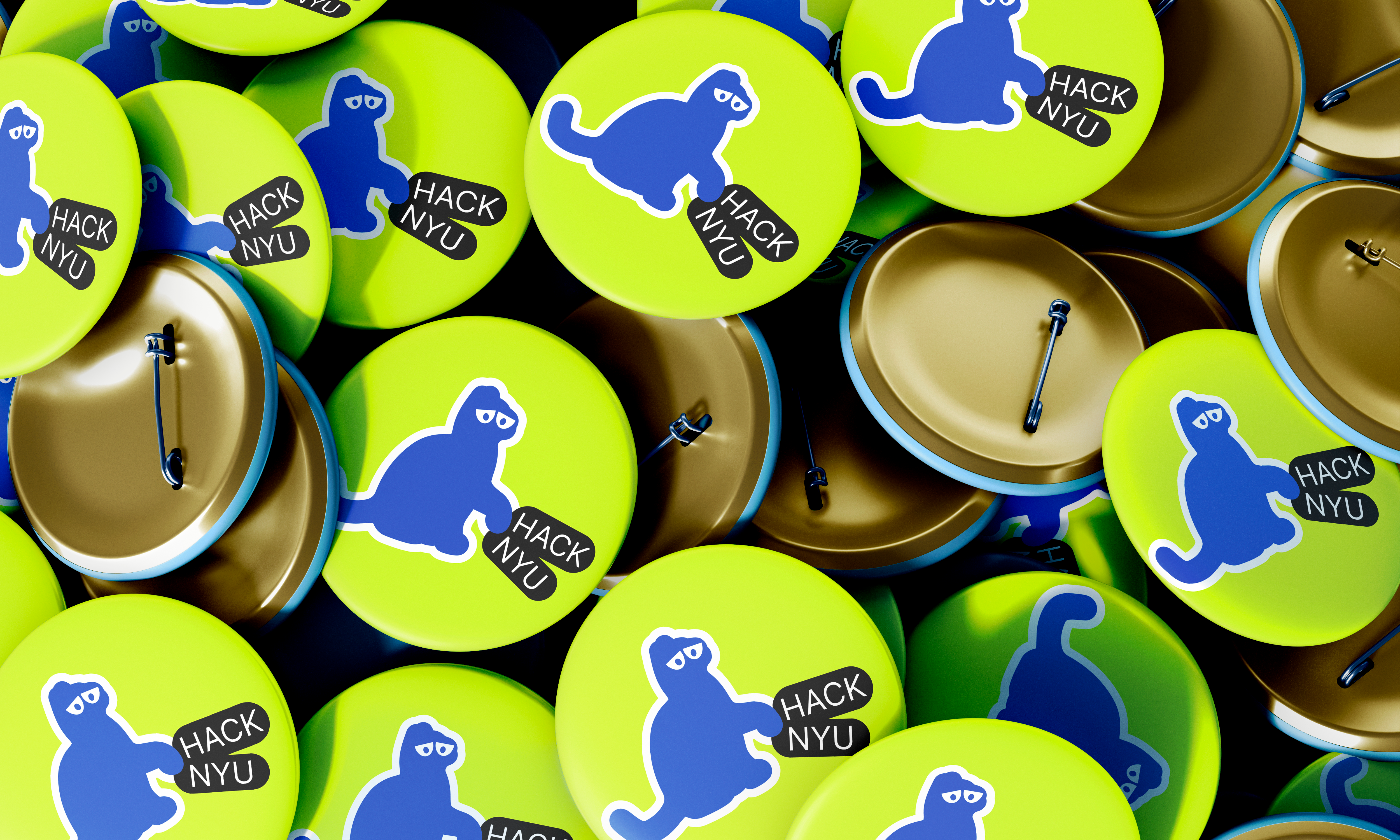
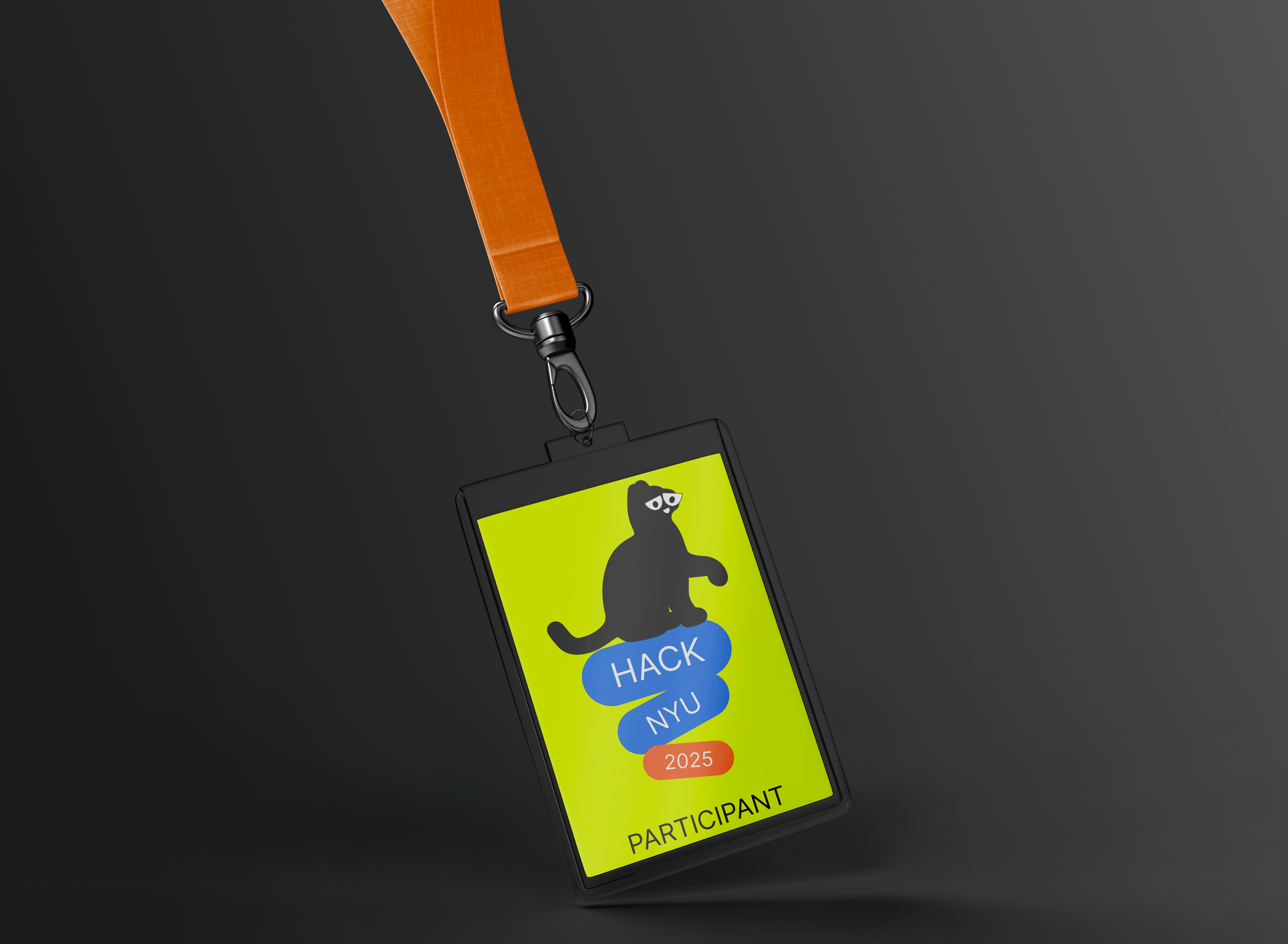
Fig. 5–8 · Sticker Set 1, Sticker Set 2, Badge Design, ID Card Design.
A hackathon venue is a temporary city — hundreds of people navigating under time pressure. Good signage is invisible in the best way: participants find what they need without friction and never notice the design.
The signage system extended the brand into a comprehensive wayfinding scheme — directional, informational, and atmospheric.
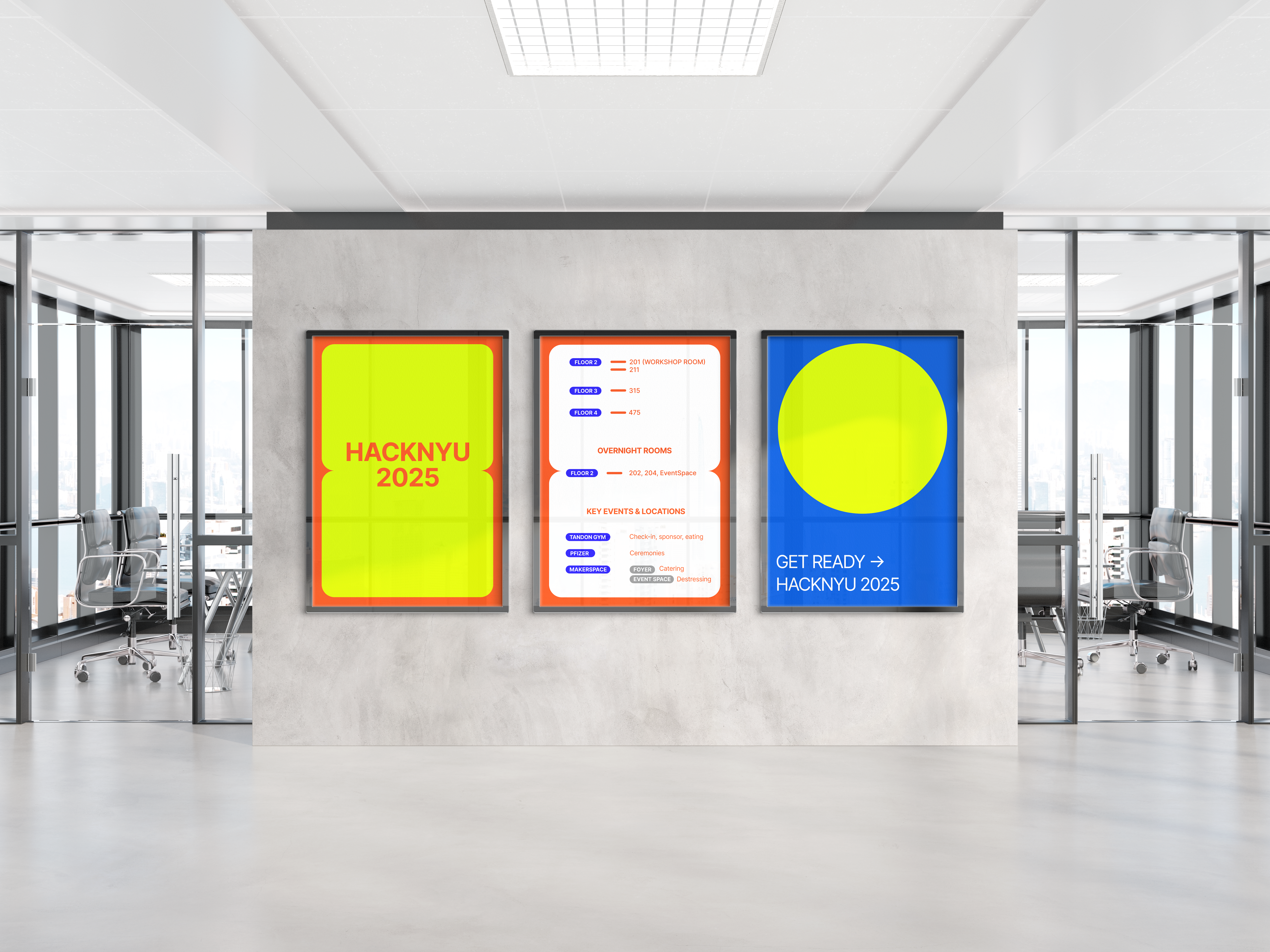
Fig. 13 · Signage system — venue wayfinding and informational graphics.
Explored themes representing innovation, collaboration, and NYU's spirit — grounding the visual direction in the event's actual purpose rather than generic tech aesthetics.
Created multiple directions balancing tech aesthetics with accessibility. Contrast ratios, legibility at size, and print fidelity were considered from the first explorations.
Iterated based on stakeholder feedback and production constraints — print specs, vendor requirements, social platform dimensions. Real-world brand work means designing for the format.
HackNYU reinforced that a brand system is only as strong as its weakest touchpoint. When your work appears on a badge, a website, a tote bag, and an Instagram story in the same 48 hours — consistency isn't a nice-to-have, it's the design.
Working to Google's standards as a sponsor elevated everything. It meant designing with production quality in mind from day one — not scrambling to upgrade files at the end.
The biggest reward was seeing participants wear the merch and share photos long after the event. When design work enters everyday life, something went right.
Every Platform. One Visual Language.
The social media campaign ran across Instagram and LinkedIn, from pre-event registration drives through to post-event wrap-up. Each asset was designed as part of the campaign system.
The tote bag rounded out the physical touchpoints — at scale, every tote on the subway is a brand impression.
Fig. 9–12 · Instagram Post, Story Template, LinkedIn Cover, Tote Bag Design.